
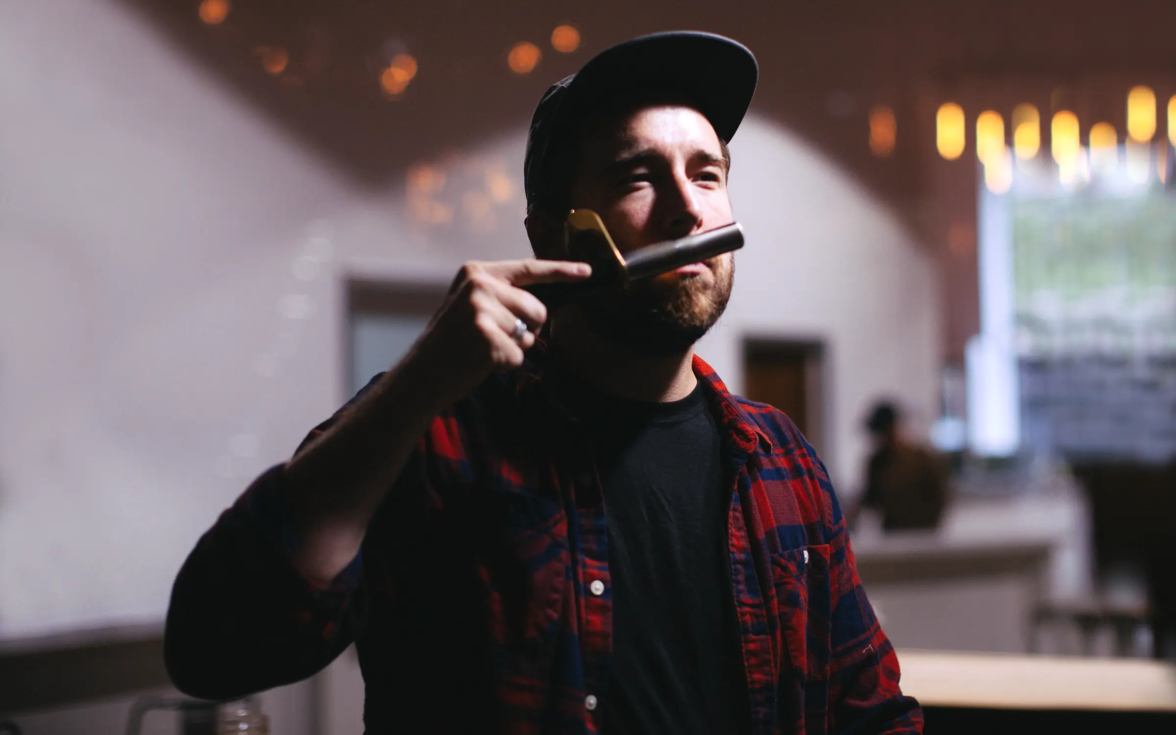
by Brent Lagerman, co-founder of Condensed & Keepers
The first batch exploded. It sprayed all over Thi and me and the white walls of the office basement, but what little survived in the bottle tasted like nothing either of us had tasted before. That afternoon, we were hooked.
I run a Brooklyn branding agency called Condensed with my wife and co-founder Teresa. In the summer of 2016, a designer named Thi Lam joined our team, and we bonded fast over a shared hobby: inventing drinks. Sparkling water, coffee, and one obviously terrible idea to combine the two in the office SodaStream.
A year later, that hobby was one of the fastest-growing CPG brands in New York City, with write-ups in Vogue and Bon Appétit and a spot on the shelf at Whole Foods. This is the story of how the Keepers brand got built, told by the people who built it.
The lunch-break lab
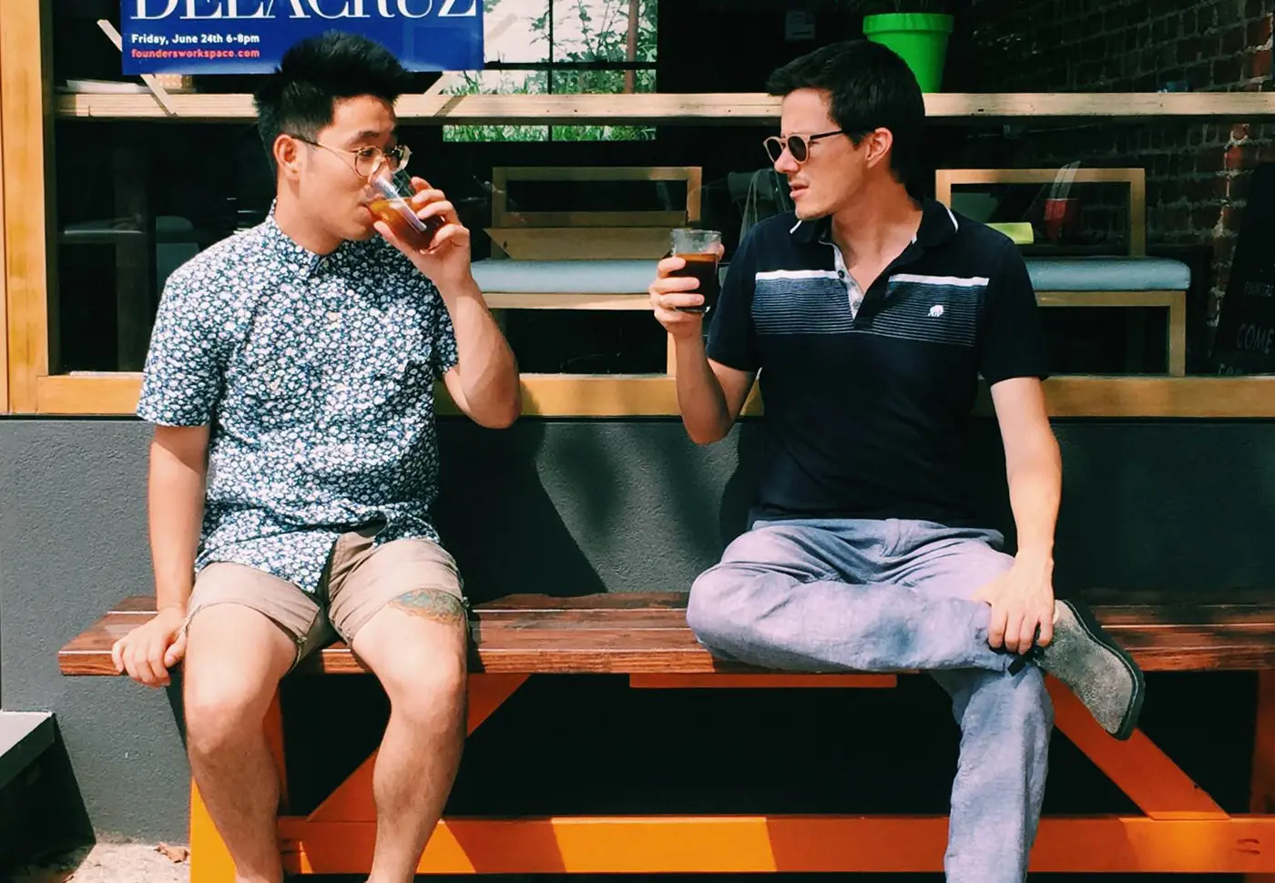
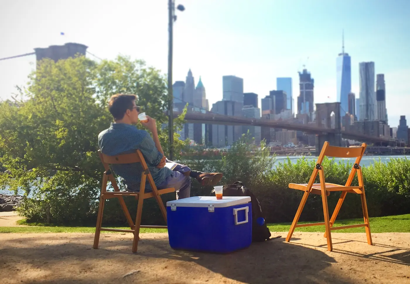
It all started at Founders Workspace, a Brooklyn co-working space my wife Teresa started so we could split the studio rent with friends, which made it a side project too. So what you're reading is a side hustle (Keepers) born inside a side hustle (Founders Workspace) and launched at a third one, a holiday market Teresa also ran. There's just something in the Brooklyn water. The upside of a co-working space is a steady supply of people who'll happily drink a stranger's experimental beverage on their lunch break: a free test kitchen.
Yuzu coffee, watermelon-water coffee, pineapple-ginger coffee, we tried everything. But the one recipe our officemates kept asking for was the citrus coffee, heavy on fresh-squeezed tangerine.
What grows together, goes together
To compete with the high-end coffee companies, we knew we needed to level up our coffee, so we brought in Thi's friend Joel from Eastlick Coffee, who paired our citrus with rare Ethiopian beans he sourced from small family farms. Because Joel was running a roasting company, he always had beans coming off the roaster, so our beans went from roasting into Keepers within a week, that's about as fresh as coffee gets.
Joel also explained why the flavors work together. Coffee is a fruit; the bean grows inside a "coffee cherry," and depending on where it's grown it carries hundreds of natural flavor notes. Pick a bean with bright, citrusy notes, add real citrus, and the whole thing reads as one flavor instead of "coffee with juice in it."
Summer in a bottle (aka our brand strategy)
Being a branding agency, our natural inclination was to make this new discovery into a branded product. Our strategy was to not treat Keepers as a "coffee drink," because new coffee drinks fight for shelf space against a thousand cold brews. We looked at where the market was actually moving. Soda sales were sliding. Sparkling water sales, meanwhile, were booming. So we deliberately planted Keepers in the gap between the two: bubbly and refreshing like a seltzer, with the caffeine and ritual of coffee, and a flavor that didn't belong to either aisle. We weren't entering a category. We were trying to invent a new one.
That gave us the brand idea, the phrase that sums up everything Keepers is: summer in a bottle, (which later became summer in a can once we switched to cans). Every choice after that, the color, the copy, the name, built off those three words.
Naming a feeling
We wanted a name that felt nostalgic, light, and above all fun. Nothing that sounded like a tech startup or another cold-brew clone.
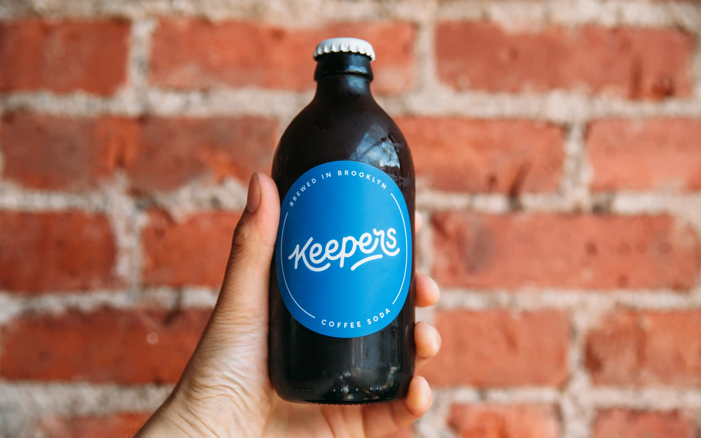
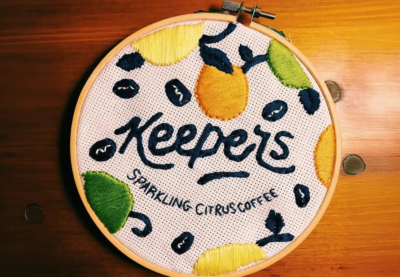
"Keepers" did a lot of quiet work. Easy to say, easy to read, and it means the thing you hold onto, the thing you go back to, the one worth keeping. It's the kind of word you'd use about something you'd bring home to your mom. It sounded like summer.
Designing the Keepers identity
We chose a script logo to play up that nostalgic feeling. Hand lettering carries a warmth no script font can fake, and we happened to have an amazing hand-lettering artist on our team in Sam Zhao. Sam worked through dozens of versions before landing on the one that felt right.
It became a clean, modern, mono-stroke script: a single consistent stroke weight, hand-drawn, retro and brand-new at the same time. It was ahead of the curve in CPG at the time, and the beverage aisle has since filled up with mono-line scripts chasing that same nostalgic-but-modern feeling.
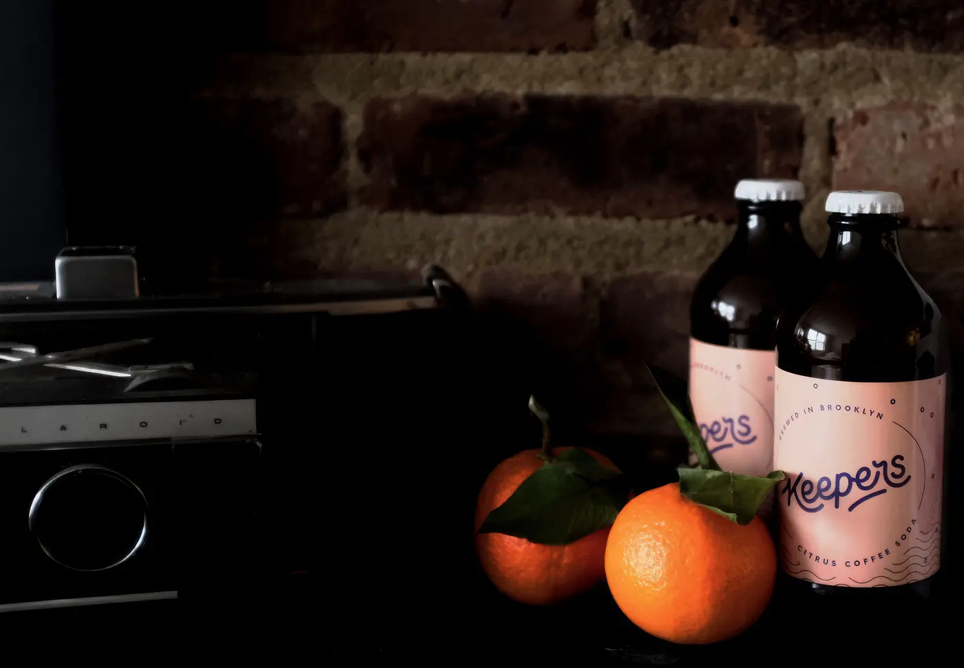
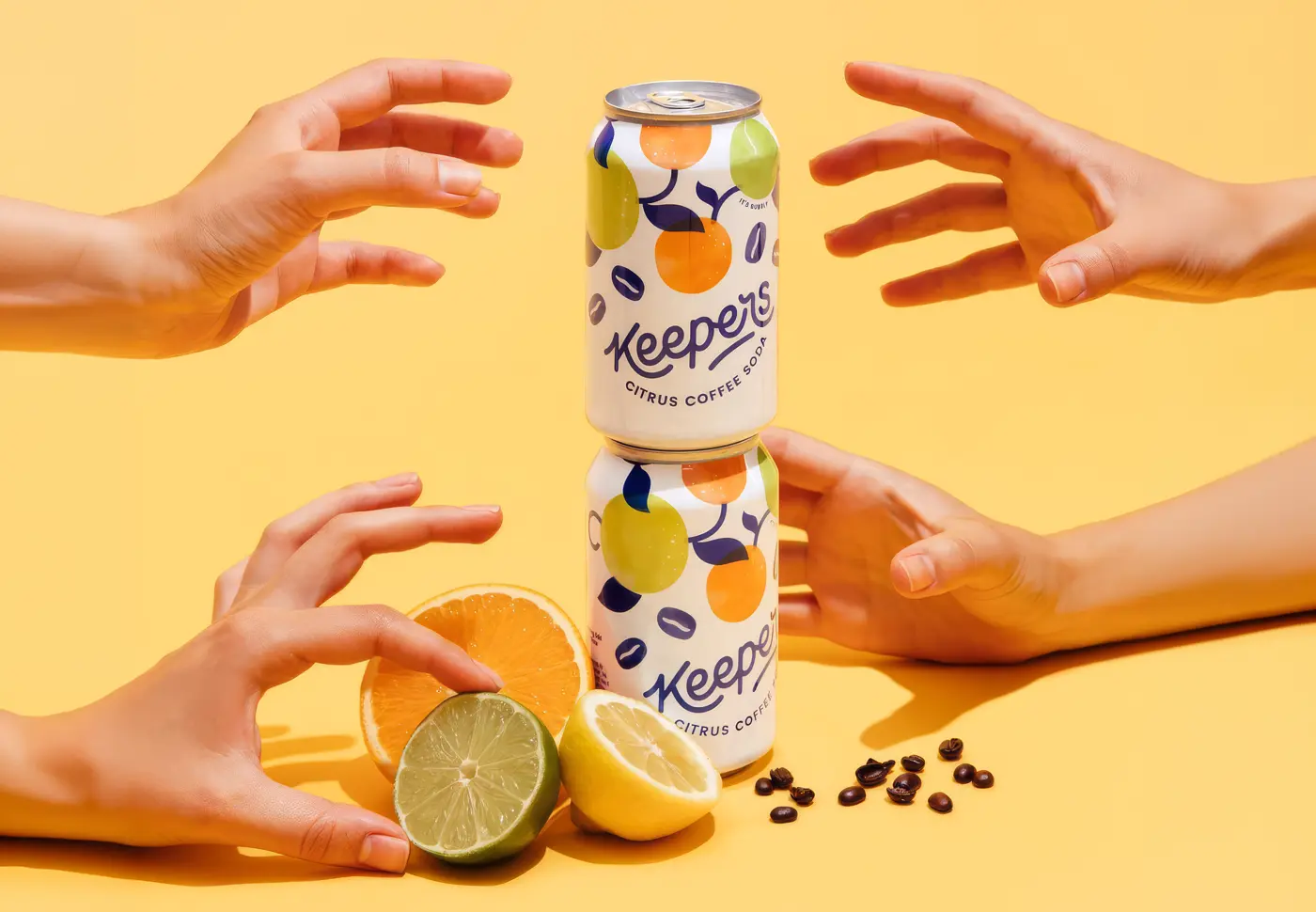
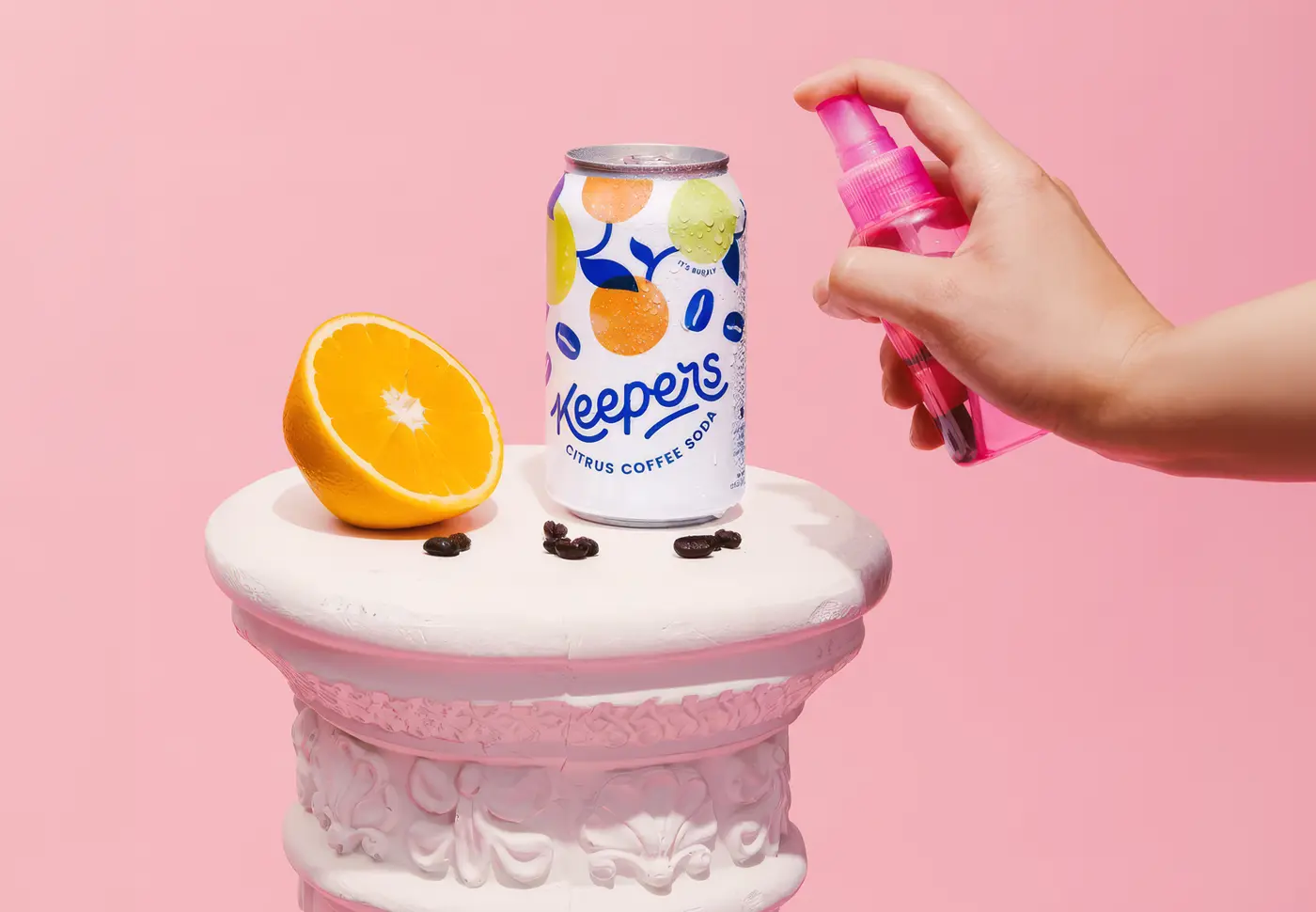
For packaging, we leaned all the way into play: bright, graphic, color-heavy, with a little millennial pink. The first bottles looked more like a trendy craft beer than a coffee, on purpose. We wanted Keepers to jump off a shelf full of moody dark cold brews and make someone stop.
The street test
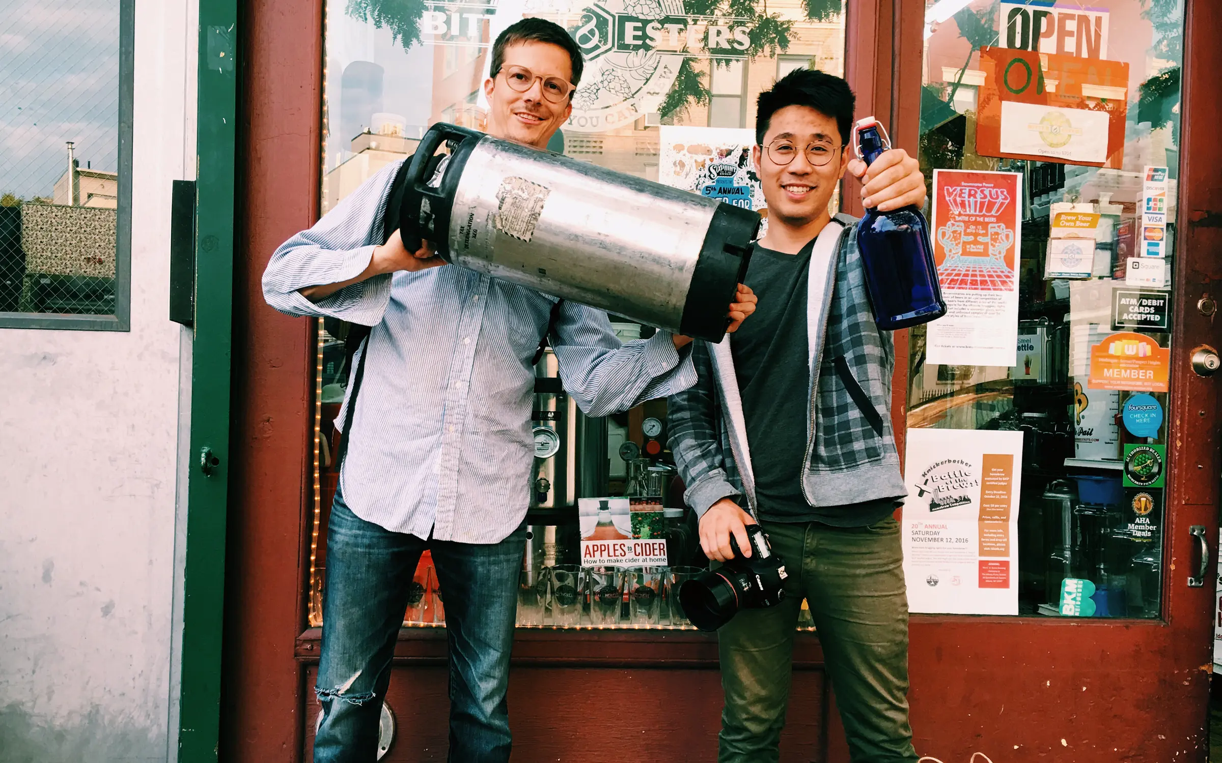
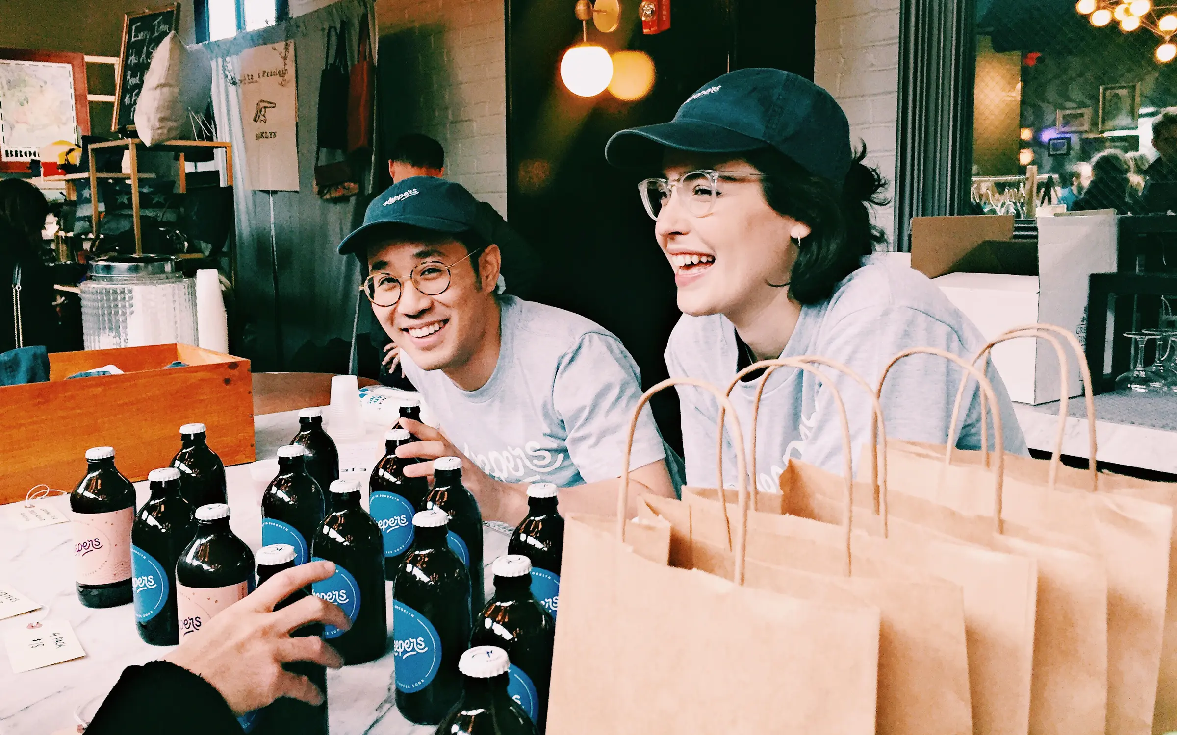
Once we had the recipe and the brand, we bottled the citrus into brown glass screw-tops and walked them into local coffee shops to see if anyone would bite.
Most of them tried to order on the spot. (Shout-out to Parkette in Brooklyn, our first real order, and the moment we knew we had something.) Which left us with the best possible problem: people wanted cases of a product that didn't technically exist yet. We told them the next shipment was on its way. Then we went and made that true.
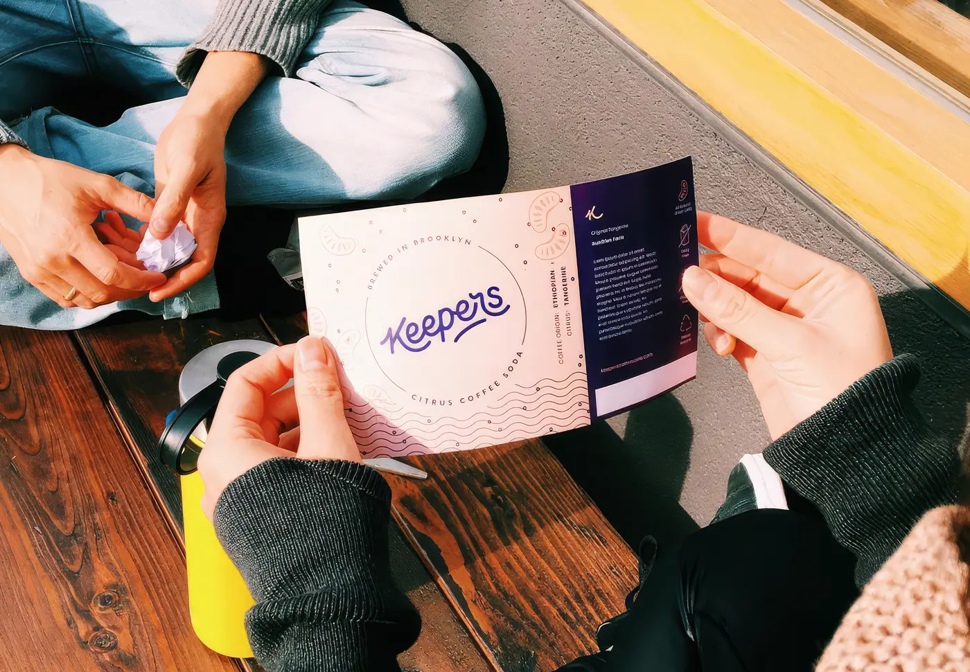
Bottle v1 Label design
The feedback from cafes was that whoever tried Keepers loved it but the label didn't say enough to get most people interested. So we set out to make a label that played up 'coffee, citrus, and sparkling'. here's our first attempt.
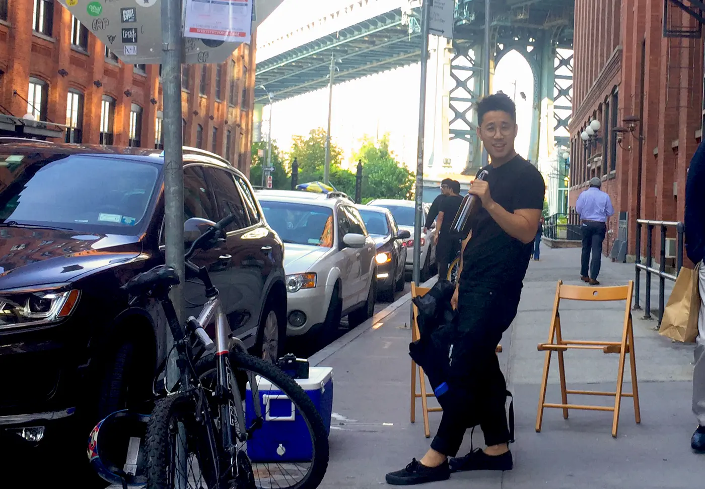
A bazaar encounter
Teresa's annual Brooklyn Holiday Bazaar was around the corner, so we stayed up late for a few nights bottling as much Keepers as we could. We sold hundreds of bottles in a weekend, which funded our first label run, and more importantly, a woman from Whole Foods walked up and told us, kindly, all the unglamorous things we had no idea we needed: nutrition facts, licenses, verifications, the actual machinery of selling food to the public.
Going legit
Turns out you can't just sell homemade drinks to people. You can give it away all you want, but the moment you start charging, you need a commercial kitchen. A quick Google search turned up Brooklyn Foodworks, a then-new food incubator in the old Pfizer building in Bushwick (later rebranded as Pilotworks - make sure to check your trademark kids!). We were now sharing a roof with ice cream makers, kombucha brewers, and a sauerkraut company. They gave us the kitchen and the equipment to turn a SodaStream accident into a repeatable formulation and get Keepers into cafés across the city. Second shout-out goes to the head of Foodworks, Nick Devane, who believed in us enough to make Keepers the first company they ever made an equity investment in.
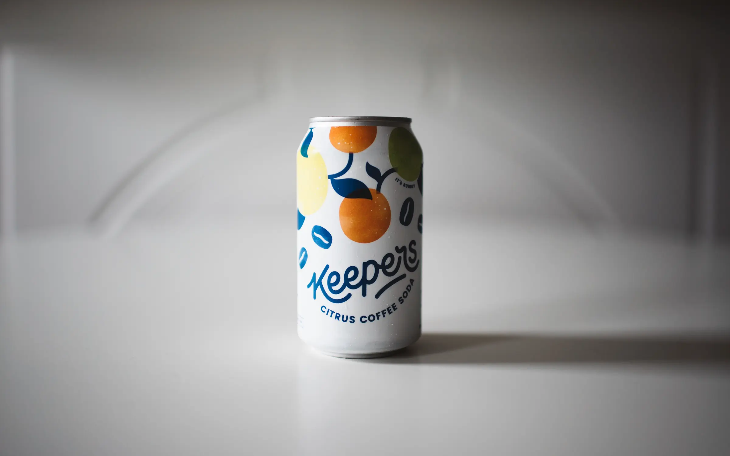
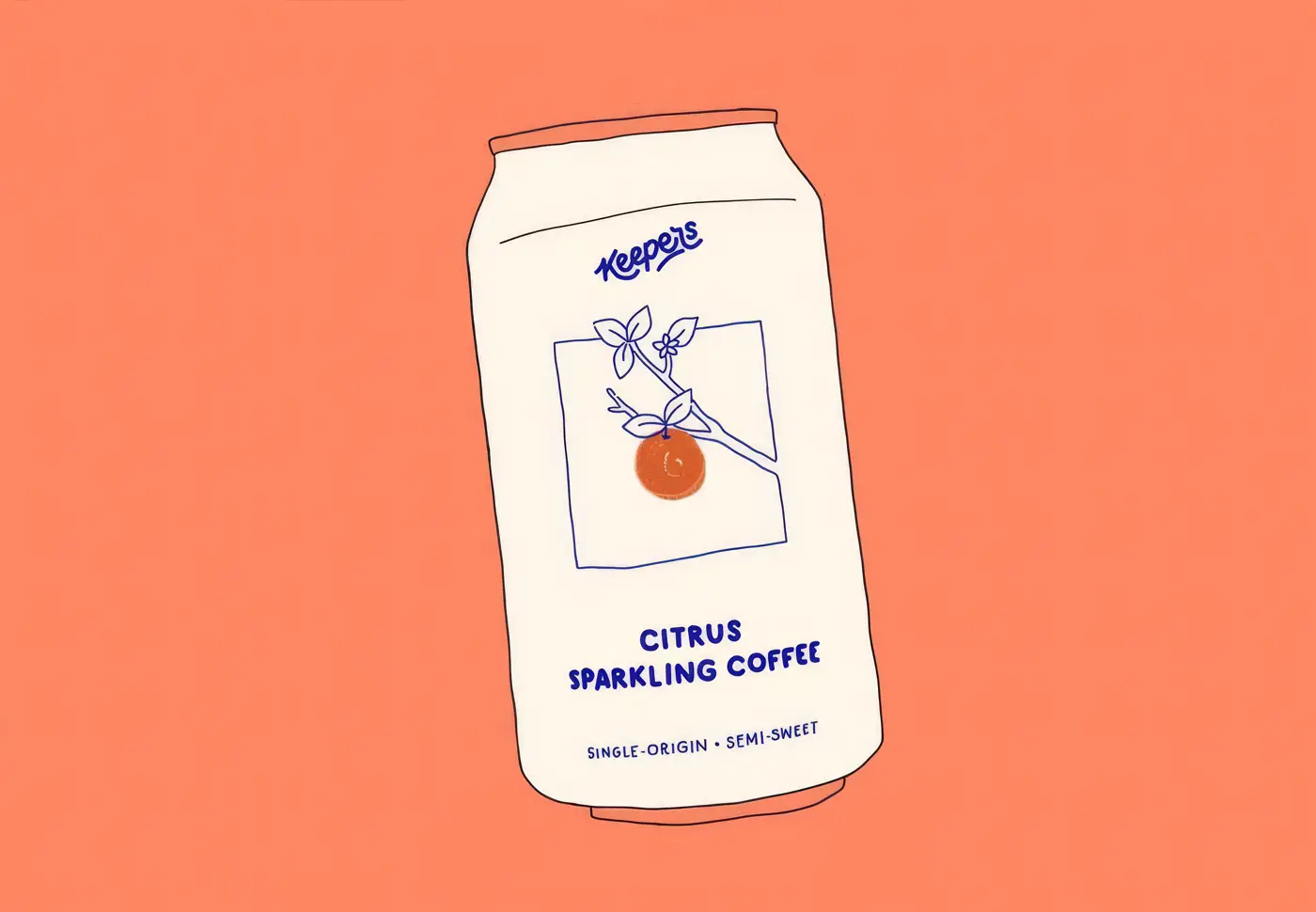
Can design v1: More obviously citrus and coffee
The existing labels still didn't really scream citrus or coffee enough, we liked how subtle and classy the design was, but your average grocery store shopper looking for something on a crowded shelf does not care about subtle, they want something to call out to them.
The Whole Foods demo
Our big break came through Chris Manca, a Whole Foods "forager" whose job it was to comb through the NYC area searching for promising local brands. What caught his eye were our shelf presence and original concept. He told us Whole Foods looks for products so unique they almost create their own new category. Which was, almost word for word, the brief we'd given ourselves.
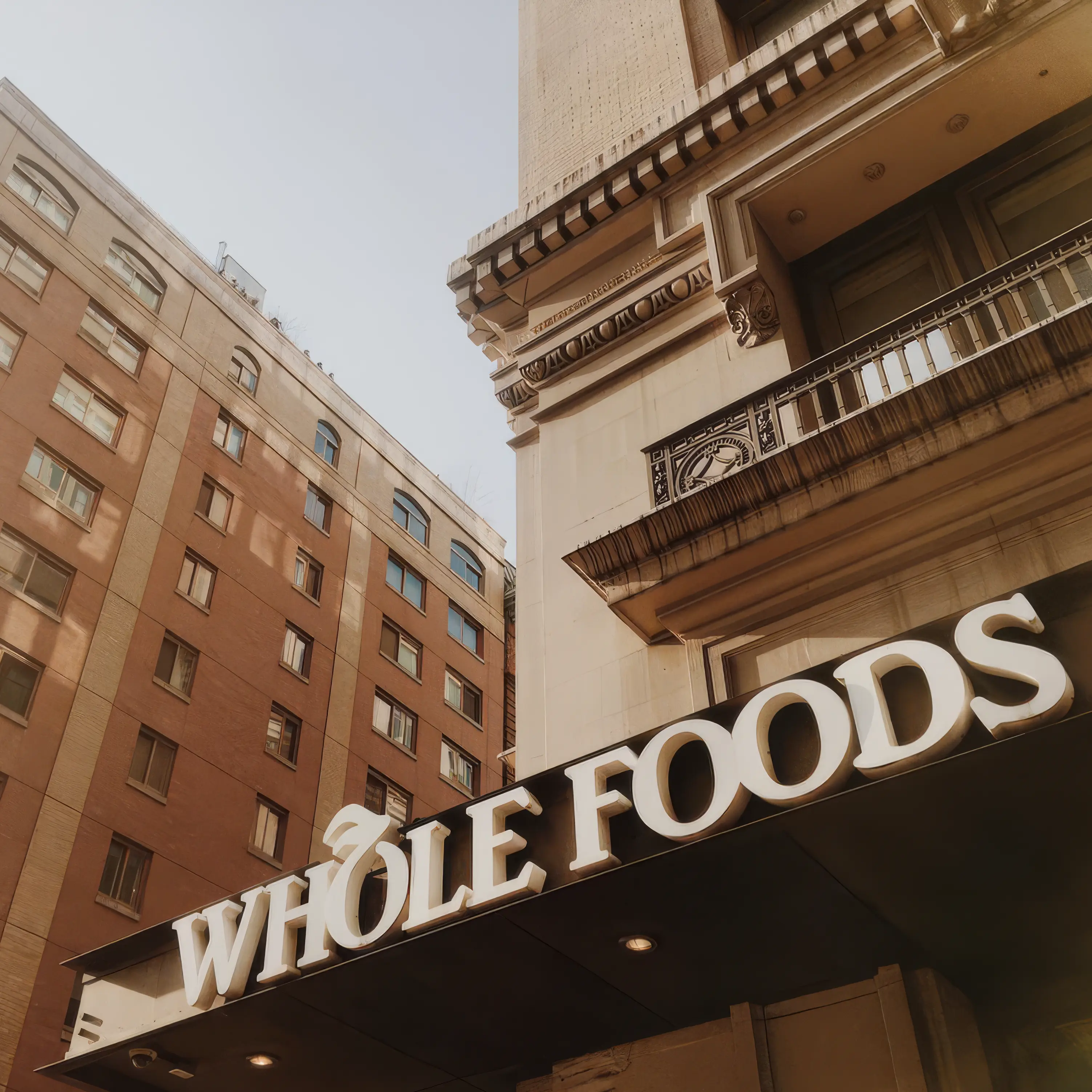
Keepers got a demo launch in the two Brooklyn Whole Foods stores in June 2017. On their advice (cans were "hotter" with shoppers than bottles), we moved our entire production to cans, one of the best calls we ever made. Strong sales pulled us into more stores fast. At its peak, Keepers was on the shelf in all 41 Whole Foods in the Northeast region, plus around 50 of the coolest coffee shops and restaurants in Brooklyn and a handful in Manhattan.
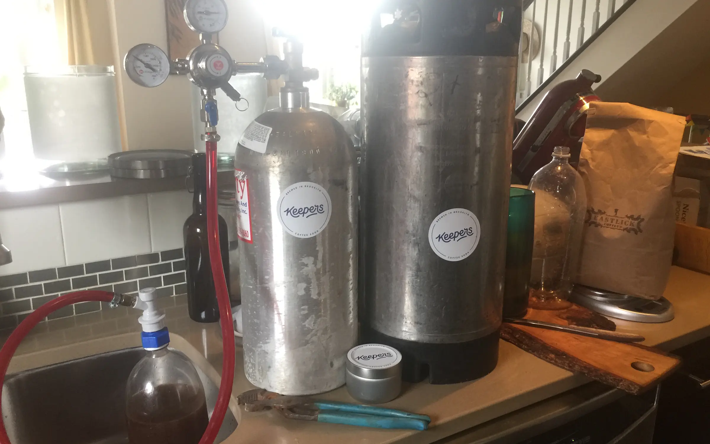
Thousands of gallons of Keepers
The ramp-up was near-vertical. We went from hand-bottling a few cases a day to running huge batches through a co-packer in Massachusetts, shout out to Michael and Dennis of Brewmasters. Filtering thousands of gallons of coffee and citrus juice is not an easy task. We had everyone calling us, distributors, more cafes, even Trader Joe's wanted us to white label Keepers and stock it as their own product.
The press we couldn't afford to buy
We felt on top of the world, and the press started rolling in. Not bad for a company with no marketing budget and no PR firm, just a cool looking new coffee company odd enough that writers kept wanting to explain it to people. A few of our favorites:
Bon Appétit called it an enjoyable slap in the face.
read full article
New York Magazine said it's like an espresso tonic, but good.
read full article
Vogue called sparkling coffee the most summer-appropriate way to get your morning buzz.
read full article
Epicurious declared that sparkling coffee is the official drink of the summer.
read full article
And The Dieline, the bible of packaging design, said our branding would stick with a consumer long after they'd taken their last sip.
read full article
There was also that time we got interviewed for a Japanese news program, hope they had nice things to say:
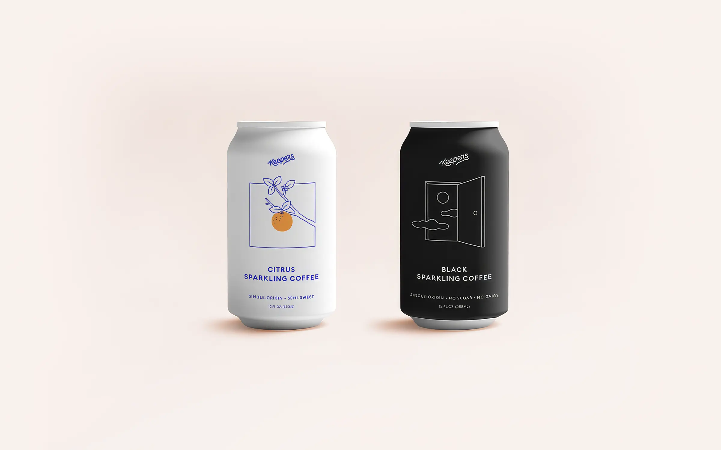
Can design v2: The can is the campaign
For a CPG drink, the can does everything. It's the ad, the shelf pitch, and the product. So we built the next version of our packaging around radical transparency about what was inside. High-end coffees had recently started showing off their region and tasting notes; Keepers went a step further: we put the actual farm the beans came from on the can, not just a region.
The idea was to chase the same bright, juicy citrus notes that made the original so good, but find them in the bean itself and add nothing, no citrus juice, no sugar. Joel tracked down a small farm in Limmu Kossa, Ethiopia, where a farmer named Abdul Wahid Sherif grew remarkable heirloom beans known for their big, fruity flavor notes. Then something we still can't fully explain happened in the carbonation: the bubbles came out smaller and finer, closer to champagne than soda, which gave Keepers Black its nickname, "the champagne of coffees."
Being a branding agency let us keep reinventing the look faster than other brands could, always trying to stay a step ahead of the market. In 2018 we redesigned again: we wanted the cans to feel more premium and justify the price without losing the personality that made people grab one in the first place. Black, minimal and confident, was exactly that.
Demand for Keepers was at an all-time high, we even had to turn down an invitation to pour at Coachella. We just couldn't make enough of it. We needed to get investors to help us scale.
Speed kills
Around this time we set out to raise a $3 million round to scale Keepers and bring it to a wider audience. We got close. (Shout-out to David Barber of Blue Hill and Stone Barns for believing in us and introducing us to his investor group.) But the honest truth is that Thi and I are great at making drinks and building brands, and not so great at scaling a national CPG company or closing investment rounds.
Then it all came apart at once. Pilotworks had been scaling too fast for its own good, and it shut down, taking our commercial kitchen with it. At nearly the same moment, the funding round meant to move us out fell through. I still remember one of the investors who'd already signed on telling us "speed kills." It stuck with me.
Keepers came off the shelf not because people stopped wanting it, but because the business underneath the brand gave out. And honestly? I was a little relieved when it all blew up. Keepers started as the thing we did to fill our free time. Then it ate all our free time, and somewhere in there the side project quietly became the full-time job. No regrets, but it felt good to go back to branding work for clients, where I don't have to think about spreadsheets, COGS, distribution, sampling, and merchandising. We know more about the CPG world than we ever should, we're like wise old sages of CPG branding at this point. Thi also took the connections he'd made across the food world during those years and turned them into Garnish Studios, a design studio that works only with food brands.
Cult status and one last run
After Keepers went quiet, the DMs didn't. Fans kept asking where they could get more, enough that we felt we owed everyone a real send-off. So we ran a Kickstarter to fund one last batch. Thi rounded up some of his musician friends in his apartment for what he called the "tiny bed concert" to drum up awareness for the campaign. We used the money to partner with Mache of Brooklyn Cannery on the final run, Mache also started his own sparkling coffee company, the pepsi to our coke ;)
Every batch of Keepers tasted great, but something about knowing this was the last one made it taste even better. The cans sold out in record time, many of them hoarded by yours truly.
Too early to last
It's strange looking back from 2026, sparkling coffee didn't make it. The brands that chased us into the category are mostly gone too. For a few summers there it was everywhere, written up as the next big thing, and then the shelf quietly emptied out. We didn't build something that lasted. We built something that, for one moment, the whole food world believed was the future. I'm convinced we were just too early. Coffee and citrus is a genuinely great combination, original and a little ahead of its time, and one day some brand with better timing is going to pick it back up and run. When they do, I hope they send us a can.
The brand has had a strange afterlife since. At one point an overseas apparel seller lifted the can design and turned it into viral knock-off merch, so we still spot the Keepers logo in the wild now and then, on shirts we never made. You can see some of the knockoffs in our last posts on Instagram.
Stolen or not, it's proof the thing stuck. The cans are long gone, but people are still showing off the brand and still asking us when the next run is coming.
Maybe one day.
Condensed is a branding agency for CPG and startup founders, specializing in naming, visual identity, and packaging design for the next generation of consumer brands. If you're bringing something new to the shelf, let's make it impossible to ignore.
Even more Keepers nostalgia on keepers.co

