Brand Strategy
Glynwood is difficult to summarize, which turns out to be a branding problem. It's a working farm in Cold Spring, New York. It's also a nonprofit that trains new farmers, incubates food businesses, advances food justice, and convenes the people rebuilding the Hudson Valley's food economy. Its old identity handled this complexity by retreating into generality: a safe serif, a barn icon, the visual vocabulary of any land trust anywhere. Nothing about it was wrong, exactly. Nothing about it was Glynwood, either.
When we started our discovery work, we did what we always do: we asked to see everything! Old photographs, annual reports, family papers. What came back was not a typical nonprofit archive.
Looking Back To Move Forward
The land was bought in the 1920s by the family of George W. Perkins, the man Theodore Roosevelt appointed to save the Palisades when quarrying was blasting the cliffs apart for building stone. Perkins convinced J.P. Morgan to put up the money to buy out the quarrymen himself, but Morgan had one condition: Perkins had to come work for him... and he did. The Perkins family ran Glynwood as a dairy farm for decades, hosting a rotating cast of weekend guests that included Dean Acheson, Robert Moses, and Angela Lansbury, who first came to Glynwood as a 14-year-old sent to America to escape the bombing of London. When development pressure hit the Hudson Valley in the 1980s, the family chose conservation over subdivision, and the farm became the organization it is today.
The pattern was hard to miss. For a century, when this family faced a choice between replacing something and preserving it, they preserved it. Our job was to make the same choice with their brand. Glynwood didn't need us to construct a new identity. It needed us to revive the one it already had.
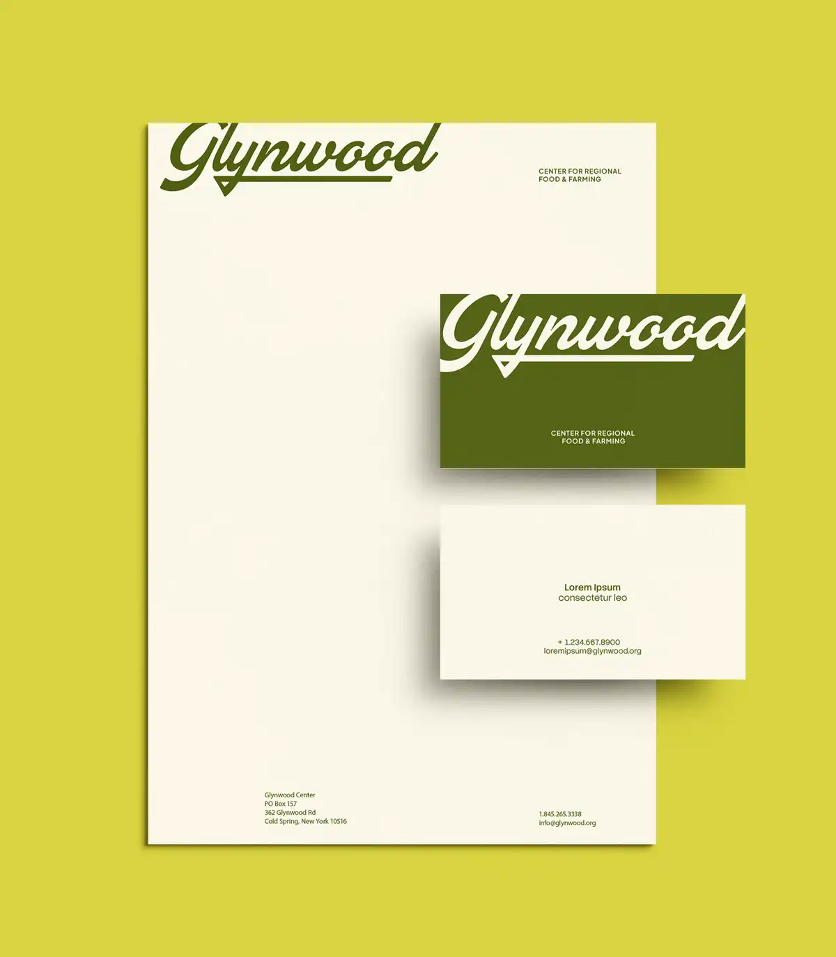
During discovery, their team showed us glass milk bottles from the farm's dairy days, each withx a hand-lettered script: Glynwood Farm, Cold Spring, N.Y. The lettering was warmer and more confident, but looked pretty dated. We knew it couldn't work as-is, but it was great inspiration, and we spent a lot of time redrawing different scripts based on the spirit of this original. It's not a replica; it's a revival, adjusted to work at every size a modern organization needs, from icon to farm gate. New growth, old roots.
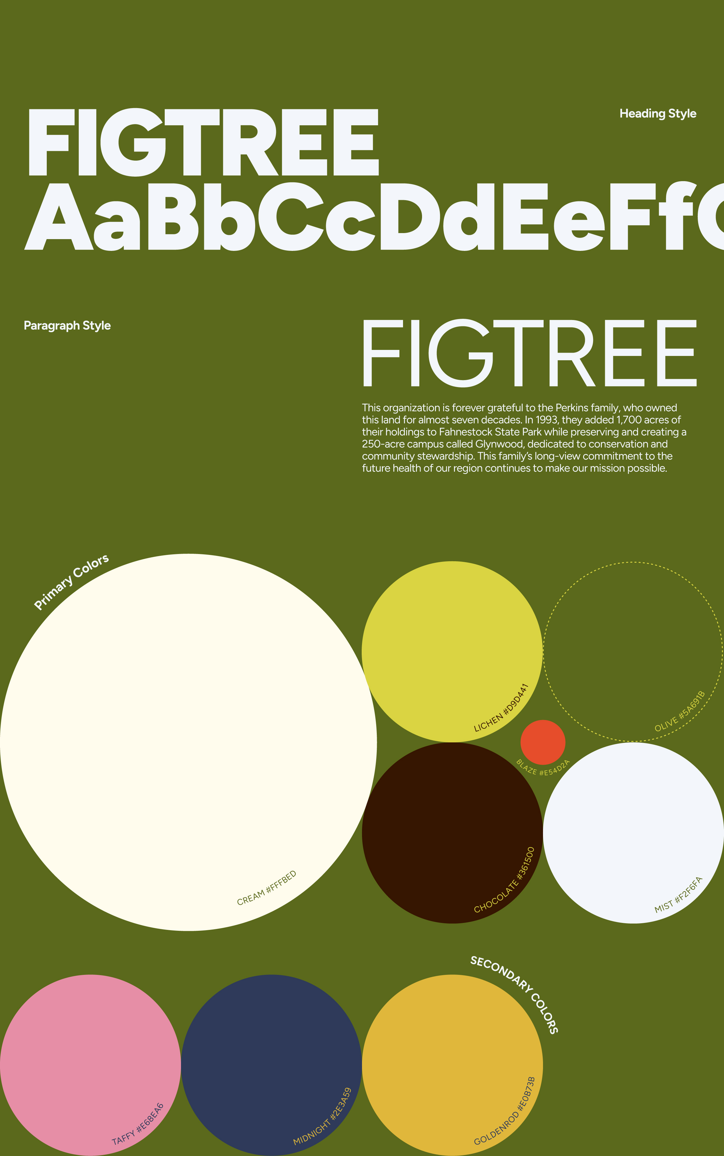
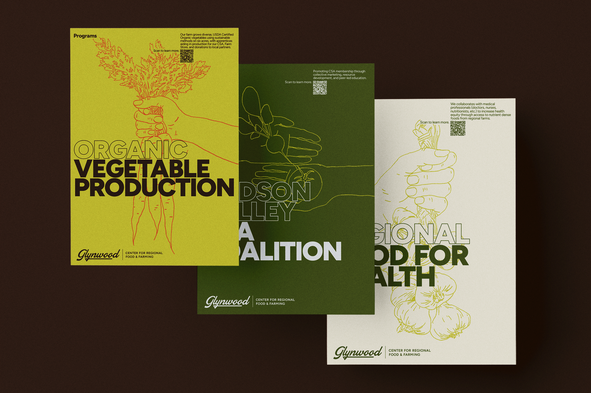
That decision set the direction for everything else. An organization asking the Hudson Valley to believe in the future of local food is making a claim about belonging to a place, and Glynwood can back that claim up in a way almost no one else can. So the identity draws its palette from the property itself: deep pasture greens, hay-field yellows, and seasonal accent tones, paired with typography that reads as human rather than institutional. The system works across program materials, event signage, publications, and the farm store, and still reads as one thing.

The new identity doesn't make Glynwood look new. It makes Glynwood look like what it has been for a century: a farm that keeps deciding, generation after generation, that this land and this work are worth continuing. And it gives the organization something built for the next chapter, and for the farmers and advocates shaping what the Hudson Valley eats next.

