
Saul Steinberg may be the most famous artist you can't quite name. You already know his work. View of the World from 9th Avenue, the New Yorker cover where Manhattan looms enormous while the rest of the world shrinks to a sliver beyond the Hudson, is one of the most reproduced (and pirated) images of the twentieth century. What's harder to name is what Steinberg was. A cartoonist, sure: he appeared in The New Yorker for nearly sixty years. But MoMA exhibited him alongside Motherwell and Gorky in 1946, his gallery shows sold out on two continents, he held an architecture degree, made a mural 240 feet long for the Brussels World's Fair, and counted Rothko, Nabokov, and the Eameses among his close friends. He was celebrated in every world he touched and contained by none of them. As he cheerfully admitted, "I don't quite belong to the art, cartoon or magazine world, so the art world doesn't quite know where to place me."
In 2017, The Saul Steinberg Foundation asked us to design its identity and first website. We've been the stewards of its digital home ever since.
By Introduction
Our work for the Adolph Gottlieb Foundation led us to Patterson Sims, a curator who sits on foundation boards across the art world. He first brought us in for the Leon Polk Smith Foundation's site, and when that went well, he opened the door to Steinberg. There we met Dr. Sheila Schwartz, the Foundation's Research and Archives Director, whose five decades in New York's museum world set the bar plainly: this had to be rigorous enough for scholars, and welcoming enough for someone who'd only ever seen that one famous cover.
That was 2017. We've been the Foundation's digital partner ever since, and in 2025 we redesigned the site from the ground up.
The Strategy
Beneath everything Steinberg made, the paintings, the murals, the carved-wood sculptures, was drawing: a single pen line of legendary economy that could become a water line, a laundry line, a railroad track, or the skyline of Manhattan, changing meaning as it traveled. He called drawing "a way of reasoning on paper."
So our first decision was an act of restraint: the brand should never compete with that reasoning. It should be the paper.
The Wordmark
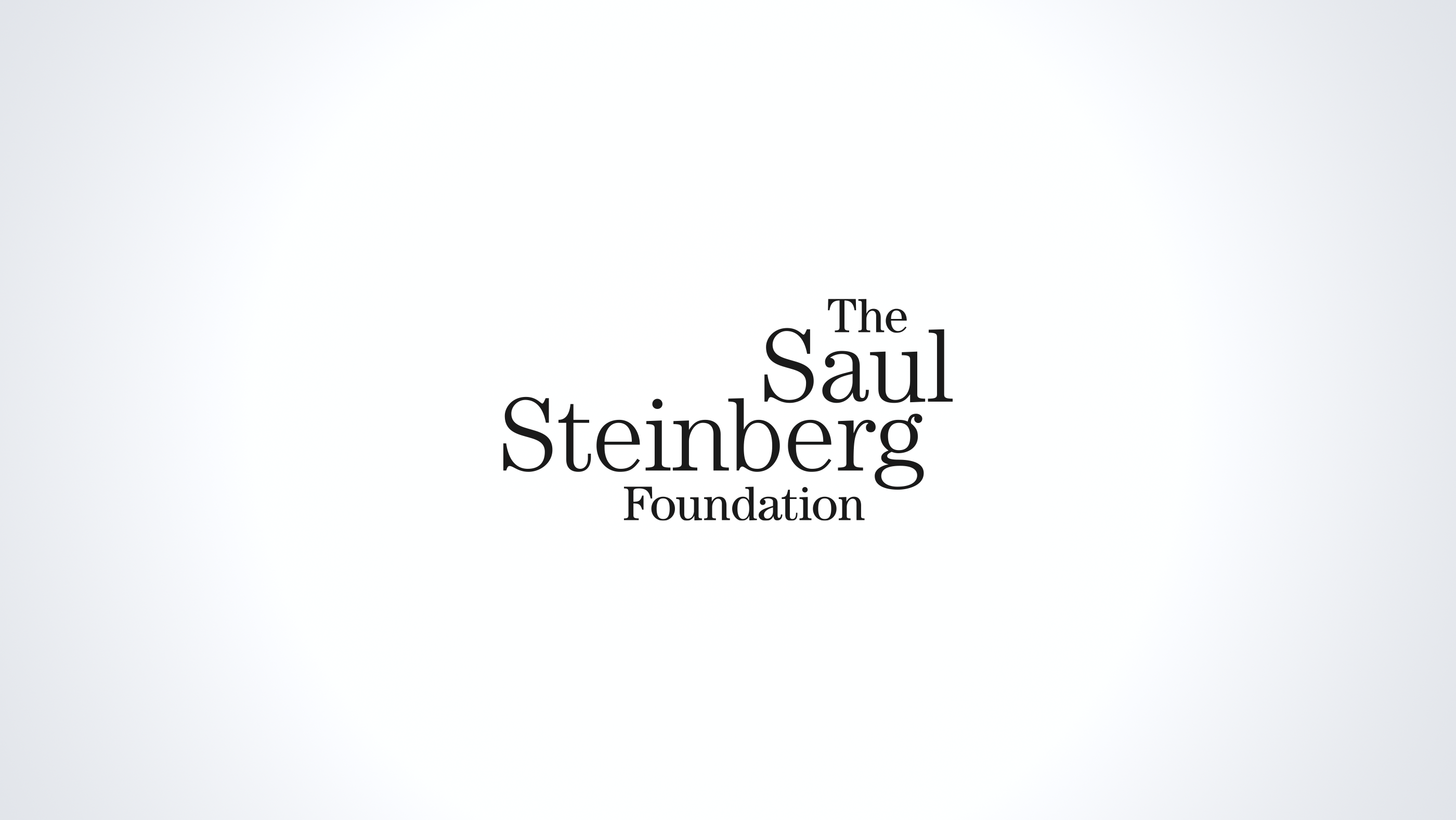
The identity allows itself one deliberate eccentricity. It's purely typographic, no symbol, no drawn mark. Nobody should out-draw Steinberg on his own website. We set it in ITC Century, a serif created in the 1890s expressly for an American magazine and redrawn for the modern age in the 1970s. A classic revisited, which is a fair description of how Steinberg treated every style he ever borrowed. The four words of the Foundation's name abandon the usual rules of a logo. No shared edge, no centering, each word at its own size, stepping down the page. Yet the composition isn't random. The scale follows the way the name is actually said, with Steinberg monumental, Saul close behind, The and Foundation small and quiet, and the words nest into one another until the whole thing hangs in balance, like a mobile. It shouldn't work, and then it does. We can't think of a better one-line biography of Steinberg.
Ink on Paper
Around the wordmark, discipline. The identity lives where Steinberg lived: a black-and-white system built on typography and line, plus a single warm accent color. Headlines are set in Literata, a serif its designers describe as "comfortable," which matters when the artwork nearby is anything but restful. Text is Libre Franklin, a modern revival of 1912's Franklin Gothic by Pablo Impallari, one of the quiet heroes of contemporary type design, whose faces you've read a thousand times without ever learning his name. A bookish serif and a workhorse American gothic sharing a page. Steinberg would have approved of the company they keep.
The Works and the Words
The site rests on two pillars, both there since 2017 and both still growing.
The first is the archive. Working directly with Patterson, we cataloged thousands of works, drawings, paintings, collages, photographs, murals, sculptures, textiles, covers, building what is now the most comprehensive Steinberg archive anywhere online. An archive built only for experts becomes a filing cabinet, and one built only for browsers becomes a coffee-table book, so we designed for both. Scholars get clear pathways through chronology, themes, and exhibition history. Everyone else gets visual, wander-friendly routes where getting lost in Steinberg's world is the point.
The second is Sheila's life-and-work essay, thirty-two sections tracing Steinberg's path from a box factory in Bucharest to six decades at the center of American art, and a project she continues to expand. It is the definitive account of his career, the kind of scholarship most artists' legacies never receive, and it's published not as a book behind a paywall but free on the site for everyone.
The 2025 redesign served both pillars. Eight years of growth had done what growth does. Sections accumulated, navigation sprawled, and a site that once felt effortless started asking visitors to work. So we restructured everything: simplified navigation rebuilt from scratch, a modernized layout, the Foundation's news surfaced on the homepage instead of buried, accessibility improvements throughout. We also redesigned the essay pages around the reading experience itself, with larger images and more comfortable text, so a thirty-two-section work of scholarship reads like what it is. A book, beautifully illustrated, that happens to live on the web.
Steinberg's Line, Continued
Steinberg died in 1999, his place in art history still unresolved. Too many worlds claimed him. The Foundation's work, and our eight years alongside it, carries the line forward, from pen to press to gallery wall to screen. Six decades and counting.
"Congratulations, thanks for the enormous time and intelligence you have put into this."
— Patterson Sims, Managing Director, The Saul Steinberg Foundation
Visit the site at saulsteinbergfoundation.org.

