Here's the complete final version:
Folio | Brand Strategy & Visual Identity
Hudson Valley Shakespeare has been staging productions in the open air for nearly four decades, and for this company nature and performance have always been part of the same experience. The recent opening of the Samuel H. Scripps Theatre Center in Garrison, New York marked a milestone years in the making: a first permanent home, set on a former golf course where fairways are being restored to native meadow. The stage flows from under the audience's feet out to the picnic lawn, with the Hudson River, Storm King, and Breakneck Ridge beyond.
The property came with a restaurant. For years it operated as The Valley Restaurant and built a reputation as one of the most sought-after wedding venues in the Hudson Valley. Under HVS it would take on a different job. Instead of hosting private events for a few hundred guests a year, it would open on performance nights and become the place where the evening starts, somewhere to have dinner and watch the light on the river before walking up to the show.
The new name was Folio. Our job was to give it an identity.

The Brief
The HVS team came to our first meeting more prepared than clients usually are, with a full brand brief and a clear sense of who Folio should be. It should feel connected to Hudson Valley Shakespeare without becoming a sub-brand. They described the relationship as closer to a cousin than a sibling, part of the same family but with its own personality.
They were just as specific about what to avoid: country club polish, wedding venue preciousness, and any literal Shakespeare imagery. Their own guidelines put it best: "we are not Shakespeare with a mohawk and sunglasses." The touchstone instead was a phrase from the theater's brand essence, "nature at play."
A Sprout in the Type
The name turned out to be a gift. A folio is a leaf of a book, from the Latin folium, and it also nods to the First Folio of 1623, the volume that preserved Shakespeare's plays. Book leaf and plant leaf in a single word, and graphically, plenty of room to play.
We sketched broadly at the start, mostly around the idea of growth, and tried a few literary symbols along the way, including a quill logo that came out great but didn't make the cut. The name was already carrying so much that adding imagery on top felt redundant, so we committed to a type-based logo. In the final wordmark, the f grows into a sprout.

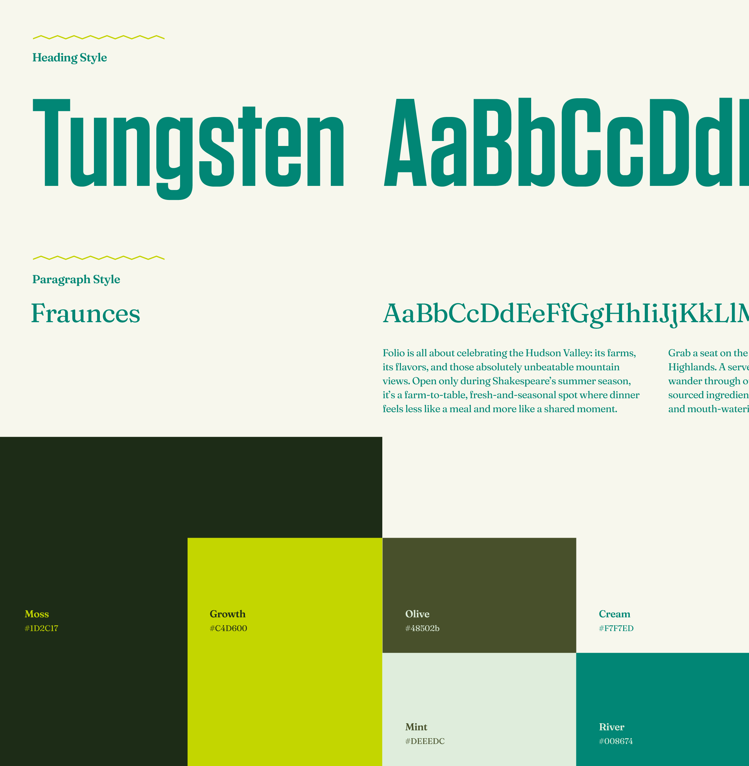

The cousin relationship was solved mainly through color and type, drawing from the HVS visual world and building on it. We expanded their color scheme and borrowed their headline type treatment. So Folio stands comfortably on its own while feeling right at home on the same campus.
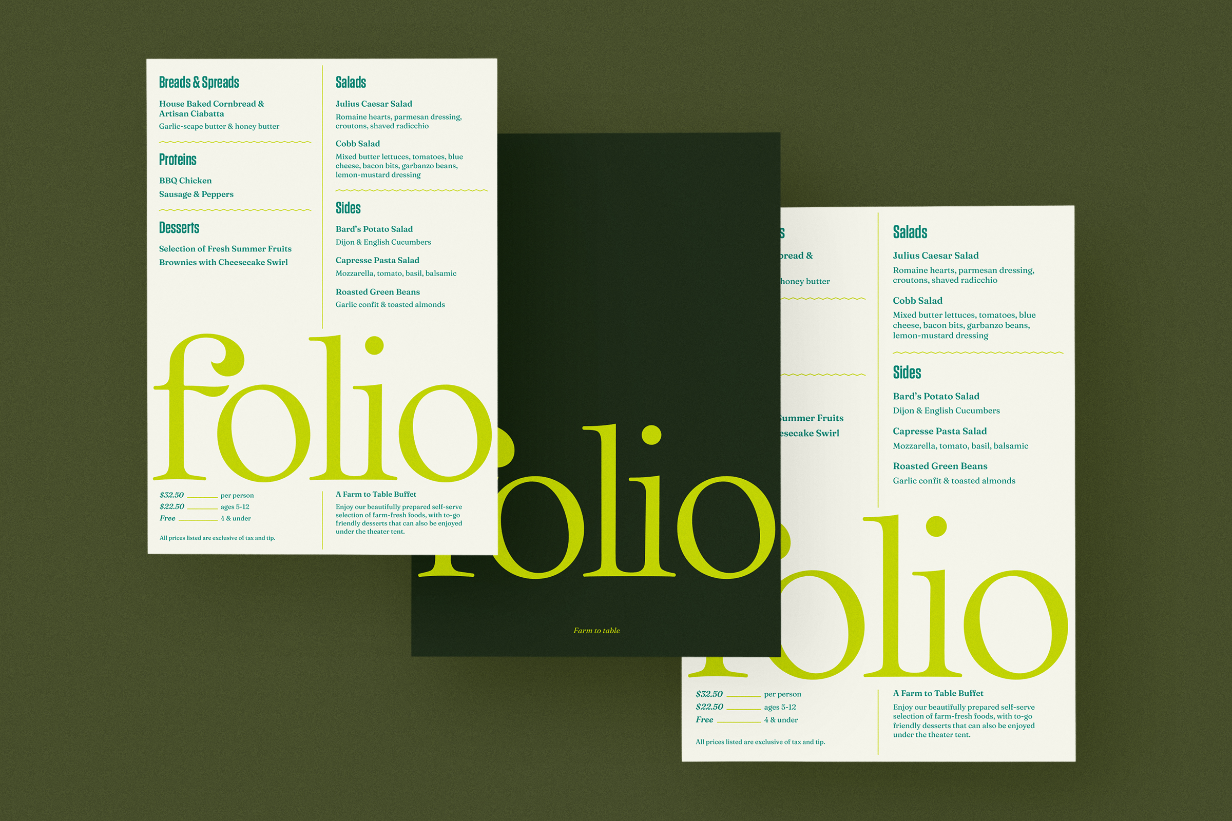
We carried the identity through to the printed pieces guests actually hold: the menus and dish cards for the restaurant's opening season. The materials match the temperament of the space: warm, handcrafted without being rustic, designed for an evening worth lingering in.
The direction was approved on the first round, and we delivered the finished brand in mid-March, just ahead of ticket sales opening for the inaugural season in the new theater.
The result is a brand with the energy of a good opening act: fun, warm, and full of appetite, getting everyone in the mood for the show up the hill.