
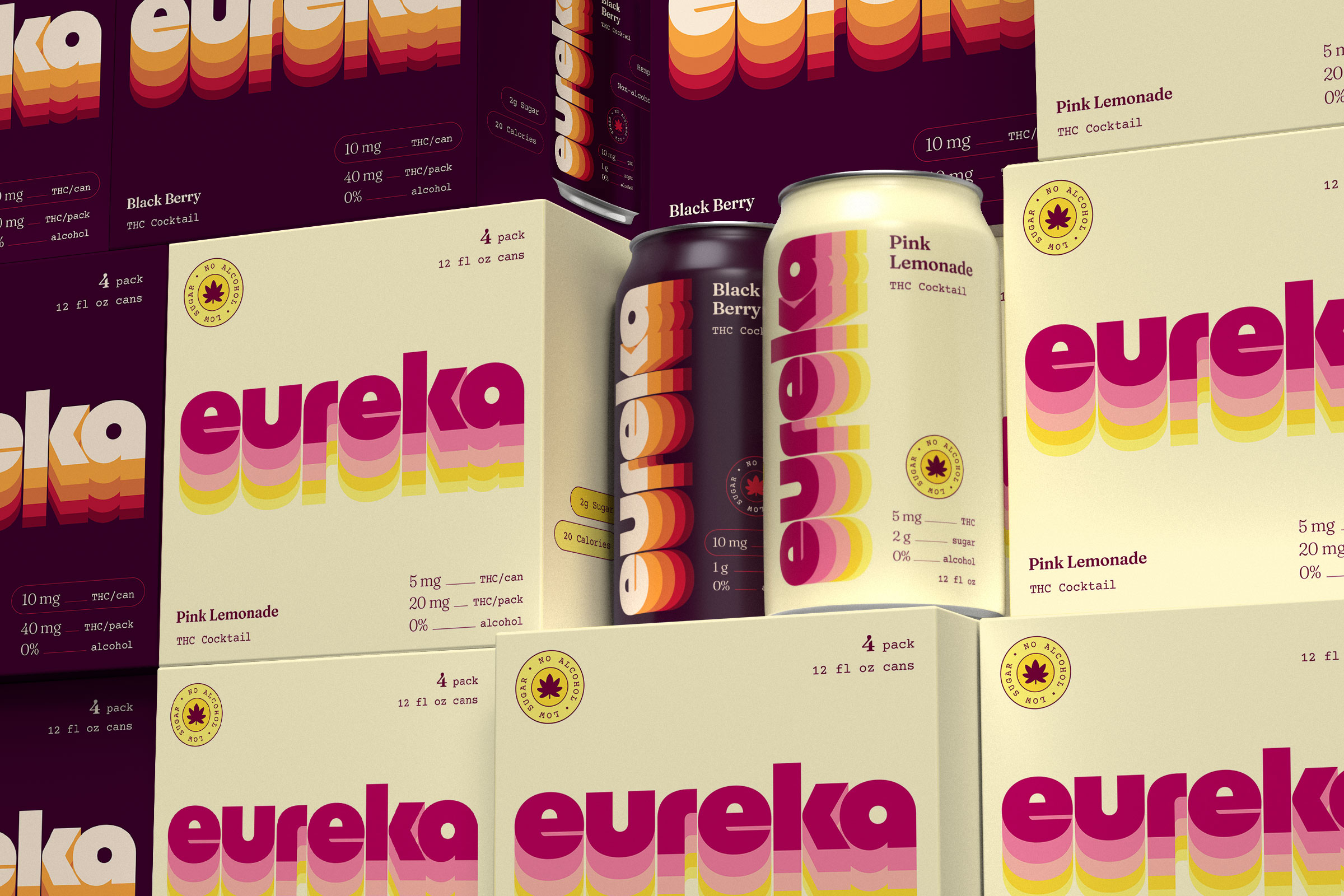
Finding a place for THC in the beverage landscape
As THC beverages move into the mainstream, the category is still figuring out its identity. For Eureka Heights, a Houston brewery with a decade of experience making beer, that presented an opportunity to enter the space with a different kind of THC drink.
Condensed built Eureka from the ground up, including naming, brand strategy, visual identity, packaging, and web design.
We wanted to create a THC drink brand for someone choosing an alternative to a beer or cocktail, so Eureka needed to feel at home in the same cooler. We moved away from the visual language traditionally associated with cannabis and toward the world of contemporary beverage branding.
A name with somewhere to go
The first person to shout “eureka” was naked in a bathtub, having just figured out water displacement.
More than two thousand years later, we named a THC drink Eureka for a Texas brewery. What a wonderful world. the name ties the drink back to the Eureka Heights brewert while capturing that moment of discovery when something suddenly clicks. For a new kind of drink, this felt like a good place to start.
Building the identity
We looked to American beverage branding of the 1970s for inspiration, when bold typography, simple illustration, and confident color helped products stand out on the shelf.
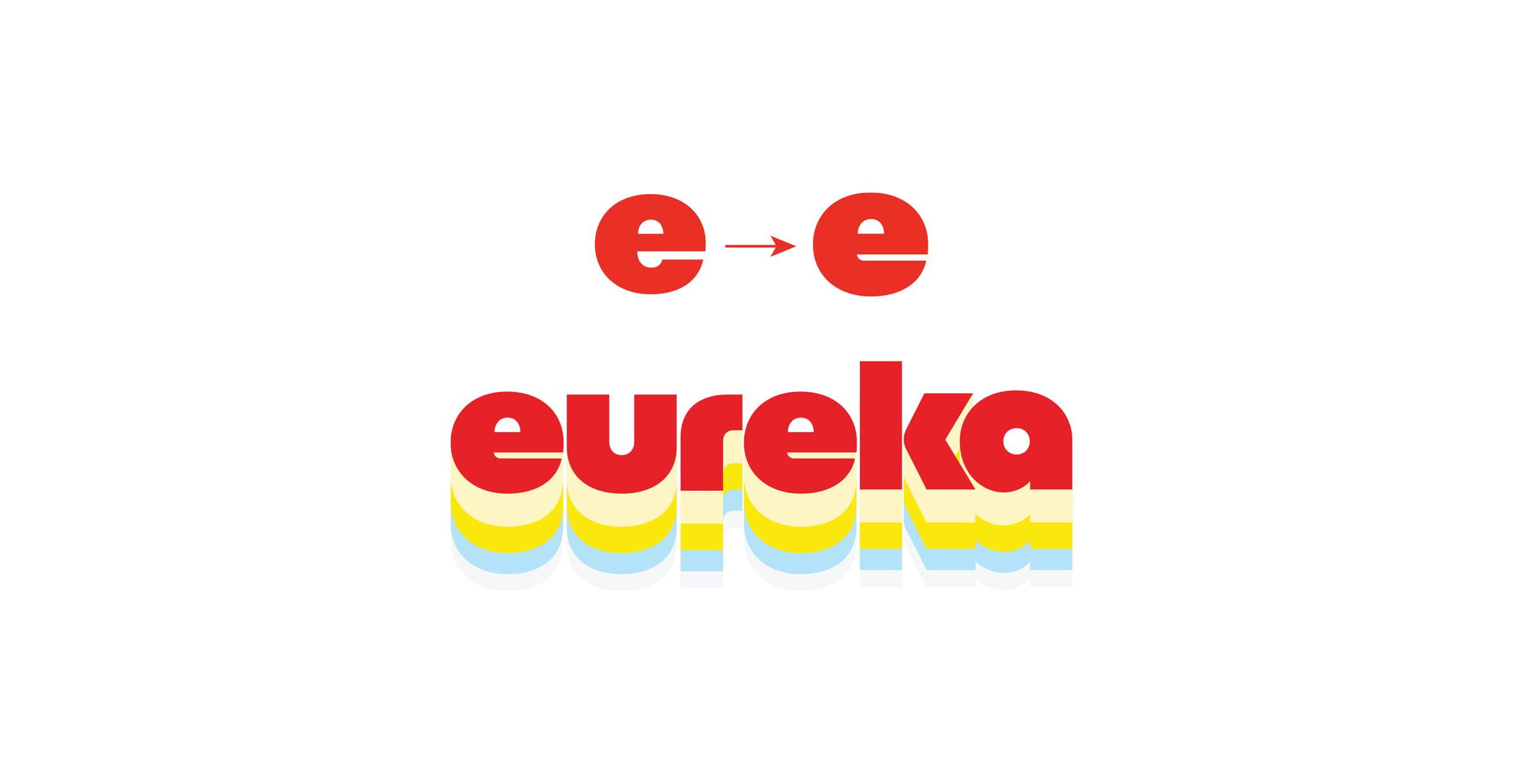
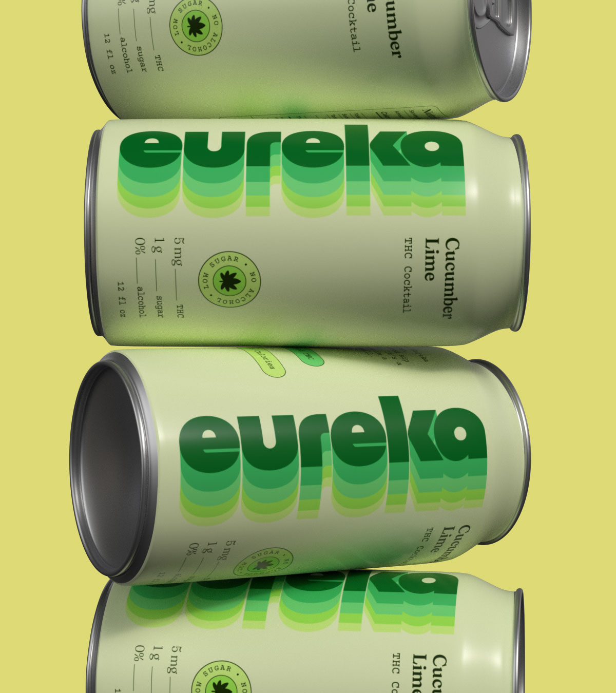
The wordmark is set in Social, a typeface by Brandon Nickerson. We customized the lowercase e's, giving them a slightly more animated, almost personified character. The wordmark then repeats down the can, trailing off as it goes and creating an echo that gives the design its rhythm.
The identity is playful and optimistic, drawing from that bold graphic language without pushing it too far into retro nostalgia.
Making dosage part of the brand system
With a THC beverage, dosage is one of the first things a consumer needs to understand. We treated it as a core part of the packaging system rather than leaving it to the fine print.
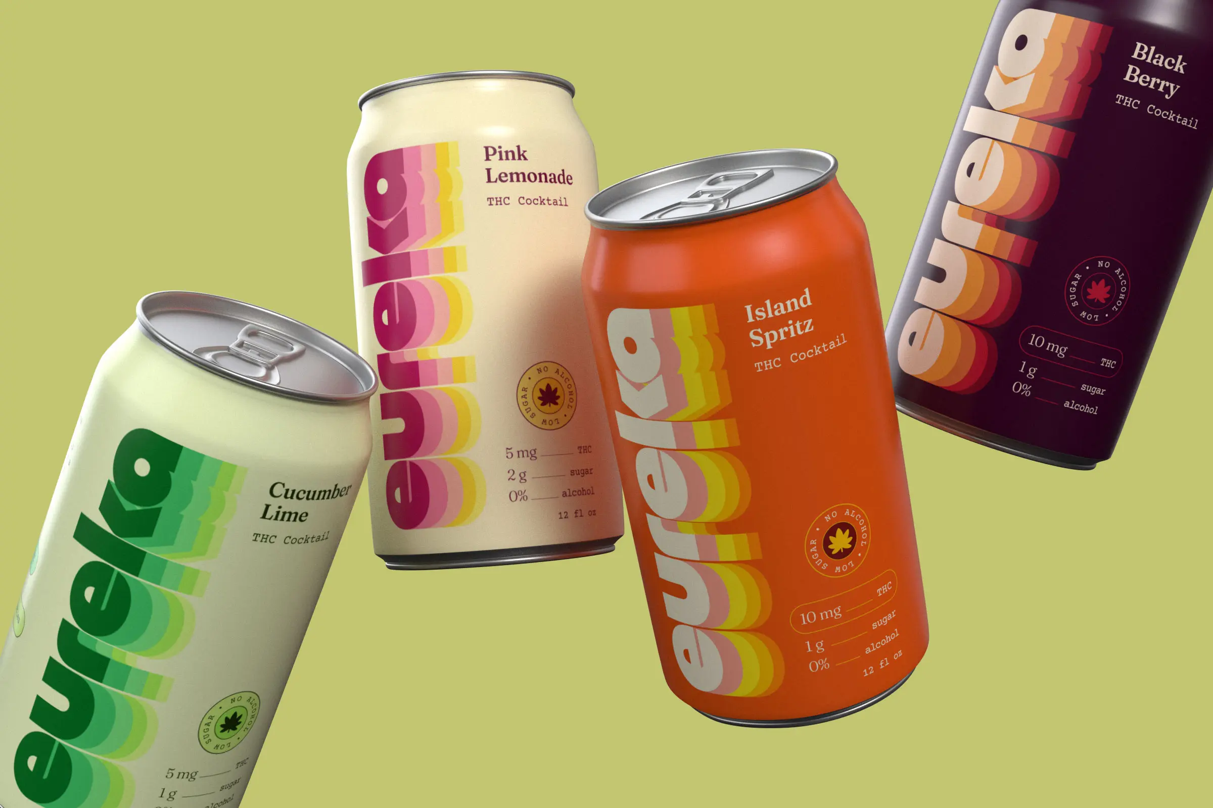
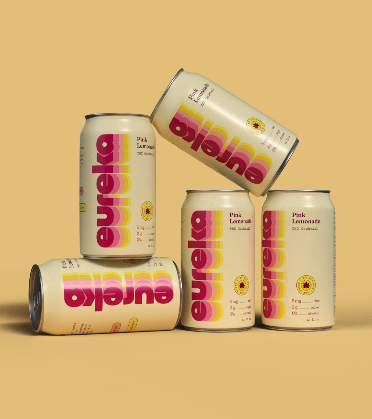
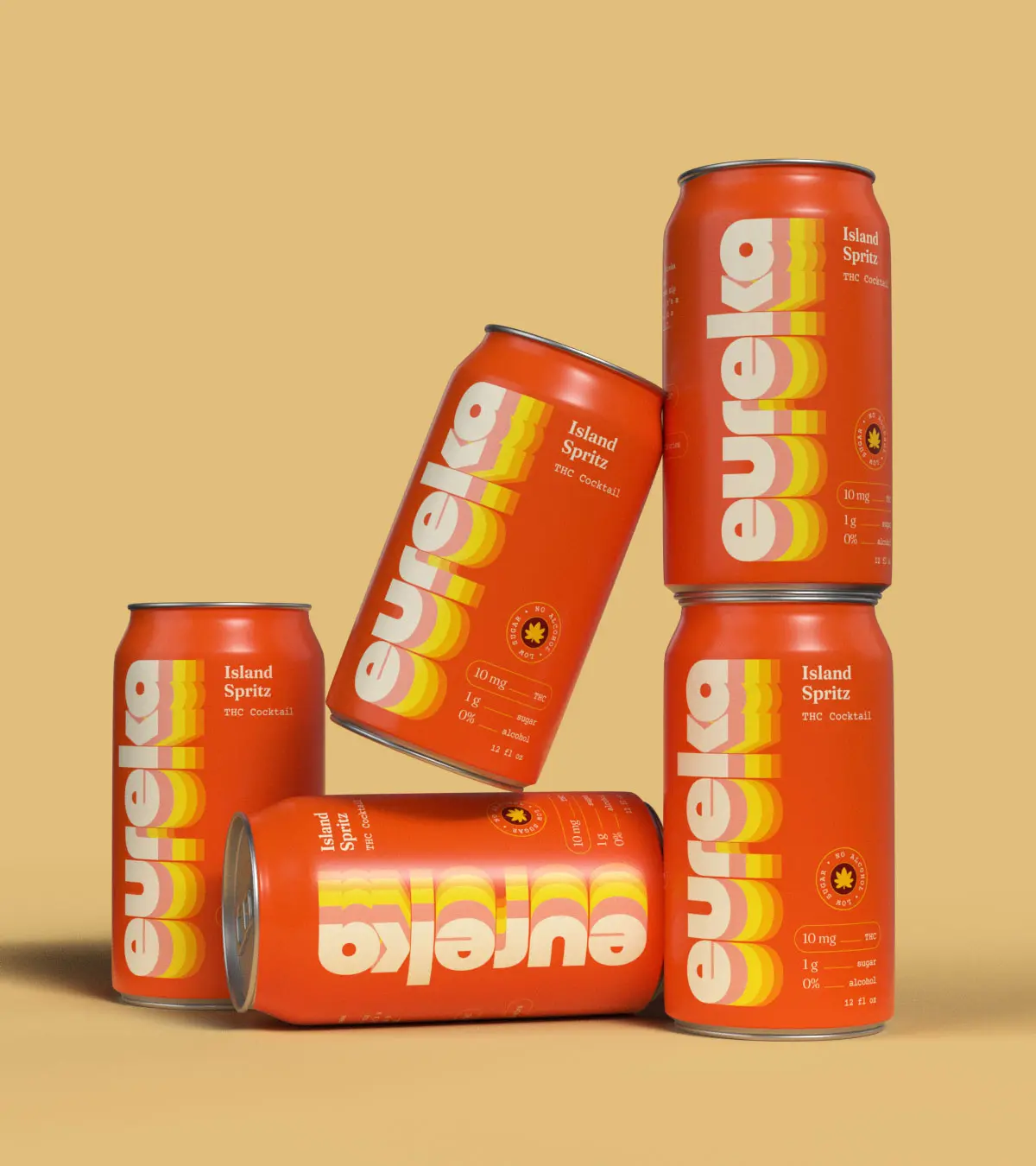
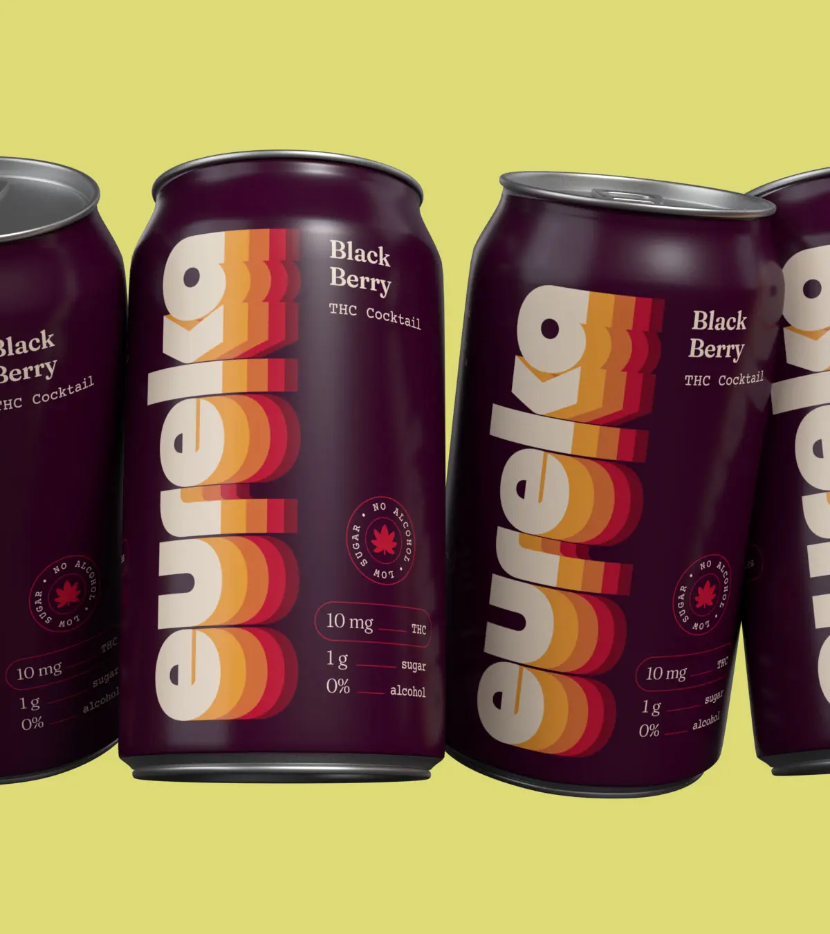
Eureka launched with four flavors: Pink Lemonade, Cucumber Lime, Island Spritz, and Black Berry. Each is available in 5mg and 10mg versions.
The 5mg cans use bright, soft pastels. The 10mg versions use more saturated versions of those same colors. This creates an immediate distinction between dosages while keeping each flavor recognizable across the range.
The system gives consumers a quick way to understand the product without having to pick up every can and read the label.
Designed to work at retail
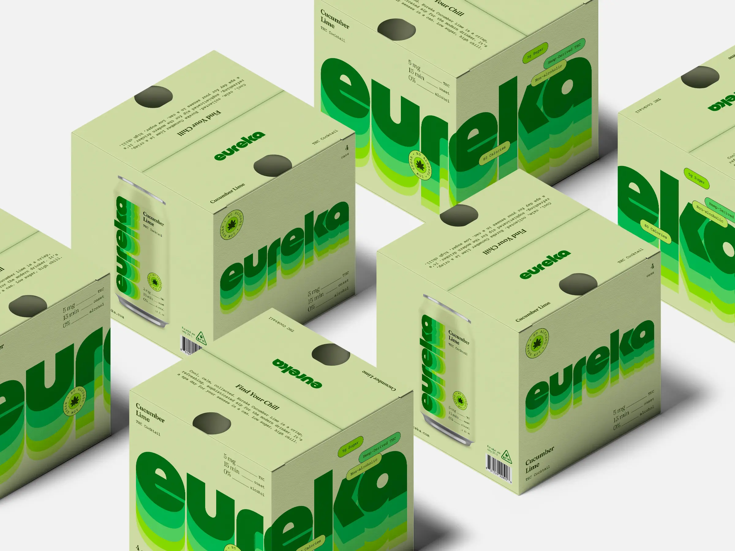
The identity had to hold together across individual cans and multipacks, where the scale changes and products need to work both individually and as a group.
On the cans, the repeating Eureka wordmark creates a strong pattern across the full surface. On the multipack boxes, an oversized logo wraps across two faces, creating a larger branded presence when multiple boxes are stacked together.
Beyond the brewery
Ten years of making beer. A completely new kind of drink. One small step for Eureka Heights. One giant leap for the beverage aisle.
We'll see where it goes.

