
A brand built to share the spotlight
Branding projects usually come with some version of the same assignment. Make us stand out. Somble handed us the opposite problem. Somble builds training platforms for independent fitness coaches, and coaches choose it because it makes their own brand look incredible. Clients don't sign up with a coach because of the software behind the scenes. They sign up because they connect with the coach's style and personality. Somble's whole pitch is that your brand comes first.
So we needed an identity strong enough to win over a skeptical, design-conscious audience of fitness entrepreneurs, and generous enough to never compete with them. The founders understood this instinctively. In our first questionnaire they told us the bright colors should come from the coaches on Somble, not from Somble itself.
It was also a crowded room to walk into. Wellness tech is saturated with incumbents and niche disrupters, and nearly all of them sell on features and dashboards. The old Somble brand played that game too, and it read as passive and generic, a plain sans-serif wordmark on a functional pitch. The white space was a repositioning, from tool to growth partner. This is a brand that speaks to people turning passion into profession, and its message to them is simple. You've got this, and we've got your back.

An Ensemble, Assembled
The name was the thread worth pulling. Somble comes from ensemble, and the more time we spent with the team, the more apt it felt. Three co-founders covering design, development, and go-to-market. A part-time crew of specialists around them. A coach-in-residence keeping the product honest. And the product itself, a platform whose entire purpose is bringing coaches and clients together into something bigger than either could build alone.
The creative turn came when we started sketching with that idea literally. We built a grid of simple geometric shapes, quarter-circles and squares and half-rounds, and began arranging them so they assembled into the letter S. Individually the shapes are almost nothing. Together they're unmistakably Somble. The concept worked on every level the company operates on. The shapes are an ensemble, a community assembling into a whole. They're also building blocks, the same way Somble's platform is a set of modular pieces that coaches configure to fit whatever business they're running.
We drew a lot of these S grids. The team loved them, which created a problem. They couldn't choose one. So we stopped trying to choose. If the shapes could assemble into the S one way, they could assemble a dozen ways, and the logo could move between them. The indecision became the idea. Somble's mark is a system of shapes in constant recombination, which is an honest picture of what the company does.

Identity in Motion
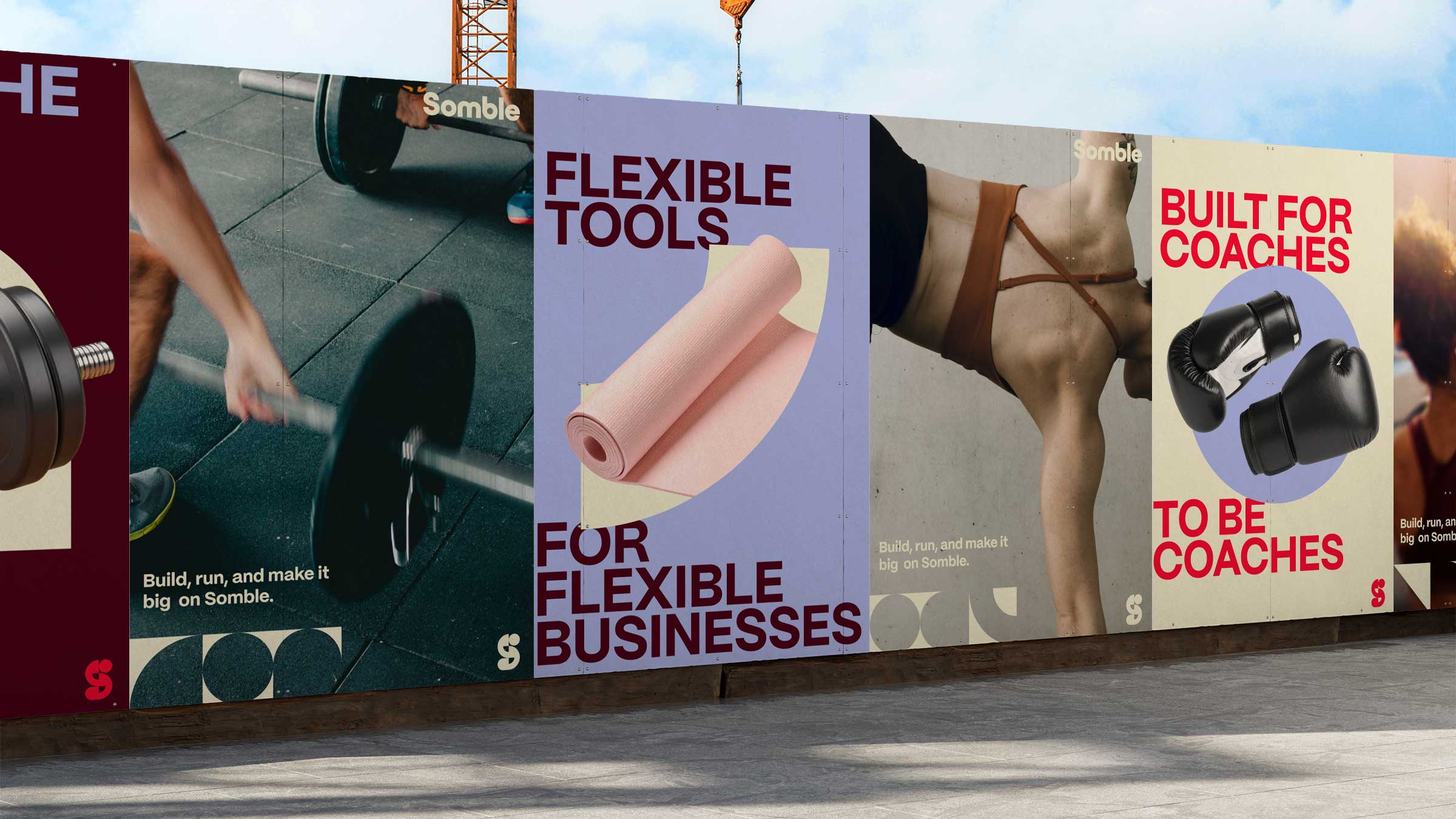
Once the logo moved, everything else wanted to move too. The building blocks became the basis of an elastic identity system that stretches, stacks, and reconfigures to suit the content around it. A confident new wordmark and palette give Somble real presence in a crowded landscape, while the system stays disciplined about where the energy comes from. When a coach's platform appears in Somble's marketing, the coach's colors and photography supply the color, exactly as the founders asked. It's a stage, not a costume.
Somble's dev team was talented and hungry for motion, so alongside the brand system we developed animation direction they could build against. We designed their client-facing website with conversion in mind, spotlighting use cases, product benefits, and community stories. They built it, and the collaboration shows. On the live site, the S in the logo reshuffles itself as you scroll, and the animating mark carries through their digital marketing and social.


Website Design
Conversion-forward and content-flexible.
We designed a fully responsive website to support Somble’s next phase of growth—spotlighting use cases, product benefits, and community stories. The layout system echoes the visual language of the brand while staying focused on usability and conversion.

The whole engagement ran on a rhythm we've come to trust. The Somble team gave us sharp feedback on strategy and product, and gave us room to run on the creative. The brand launched in May 2025, and the team really rallied around it.
The Results
Dominic D'Alexander, Somble's CEO, put it this way:
"The Condensed team did amazing work. We're in a super crowded industry and they found the white space, generated tons of awesome ideas, and always over-delivered on the execution. They were also super receptive to feedback, while standing their ground on the more creative aspects. As a bonus, we stayed within budget and timeline. All in all, could not recommend more highly."
We'll take it. Some projects are rescue missions. This one was simpler. A company whose name already contained its best idea, waiting for someone to draw it.
UPDATE: Somble was acquired in 2026 by a team of operators with decades of experience in group fitness coaching.
01
Project Services
02
Project Team
Condensed Leads
Brent Lagerman, Teresa Lagerman, Sam Zhao
Somble Leads
Dom Alexander, Matt Barnett, Ian Waltz
Copywriter

