
AI Before AI Was Everywhere
In 2021, when Crossing Minds came to us, nobody's pitch deck said "AI-powered." ChatGPT didn't exist, and recommendation engines were still a niche corner of machine learning. Which made Crossing Minds an unusual case: most startups have a brand that overpromises while the product struggles to keep up. Here the product was ahead of the industry, and the brand was the thing lagging behind.
The team came with serious credentials. Alexandre Robicquet and Emile Contal came out of ENS Paris-Saclay with advanced degrees and published research between them. Sebastian Thrun, who founded Google X and led Google's self-driving car program, was a co-founder. They had just closed an $8M Series A on a thesis that sounds obvious now but wasn't then: the future of AI belonged to systems that genuinely understand people. Not demographics, not segments. Individual taste. And they could do it without collecting any personal information.
Seen Around the Corner
Every brand in the personalization space was making the same mistake, just in one of two directions. The technical brands looked dark, cold, and forgettable. The friendly brands looked like they didn't have any real technology underneath. No one had figured out how to look smart and warm at the same time. That was the opening for Crossing Minds.
It mattered because of who was buying. Their customers were mid-sized consumer companies who saw personalization as a nice-to-have. Complicated. Something for next year. A cold, technical brand would confirm those fears. A friendly one would tell them what the product actually promised: easy to start, worth the effort, one step ahead of what your customers want. That phrase became the heart of the strategy. One step ahead. From it we built a voice that's confident but not intimidating, enthusiastic without turning into a sales pitch. The kind of company that sees around corners for you.
Two Planes Crossing
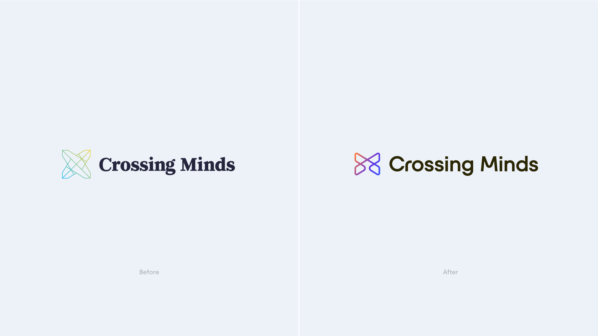
The old logo was a sharp, star-like X, more shuriken than synapse. It didn't say much beyond "tech company," but there was equity in it, and the shape gave us something to build from.
The new mark keeps the X and gives it a reason to exist: an abstract illustration of two planes crossing in three-dimensional space, a nod to the name itself. Crossing minds, literally. It's drawn in a single monostroke line, so it keeps the precision of a technical drawing, and a gradient flowing along the stroke gives it life. Where the old mark had points, the new one has curves and continuity. Anyone who knew the company before would still recognize it.
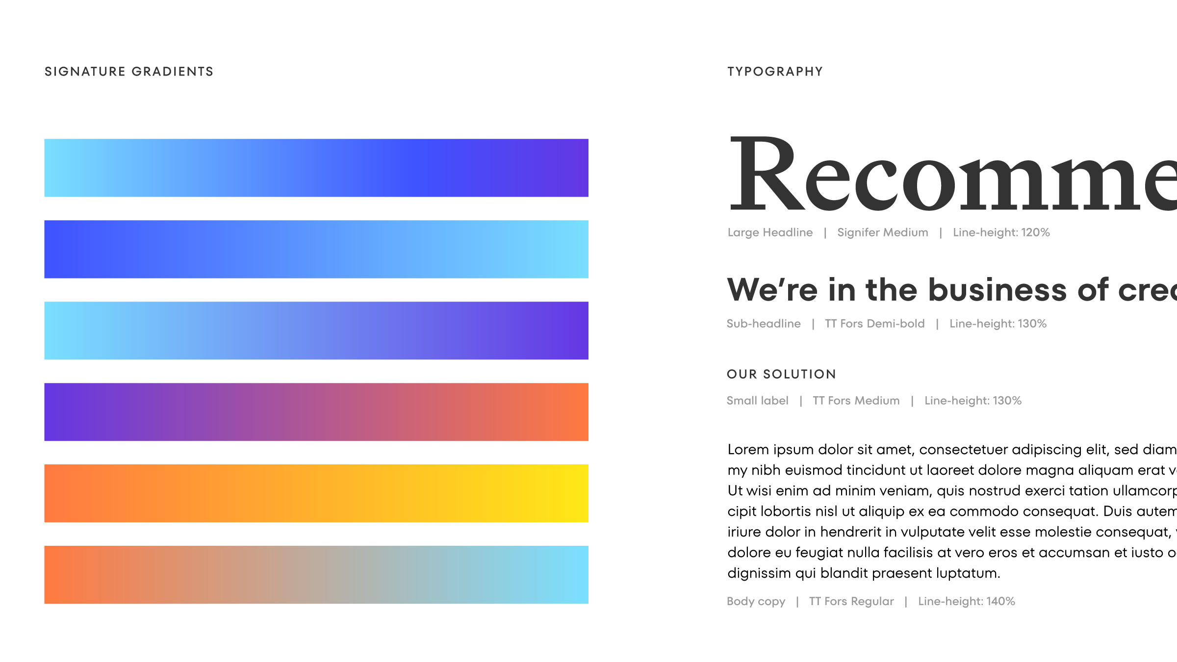
Those gradients run through everything the brand touches. We built a custom gradient system, yellow into green into blue, that moves across the wordmark, the interface, and the marketing materials, and we helped bring the identity to life with animation. Like the product itself, the result looks simple, with a lot of careful engineering underneath.


What Does an Algorithm Look Like?
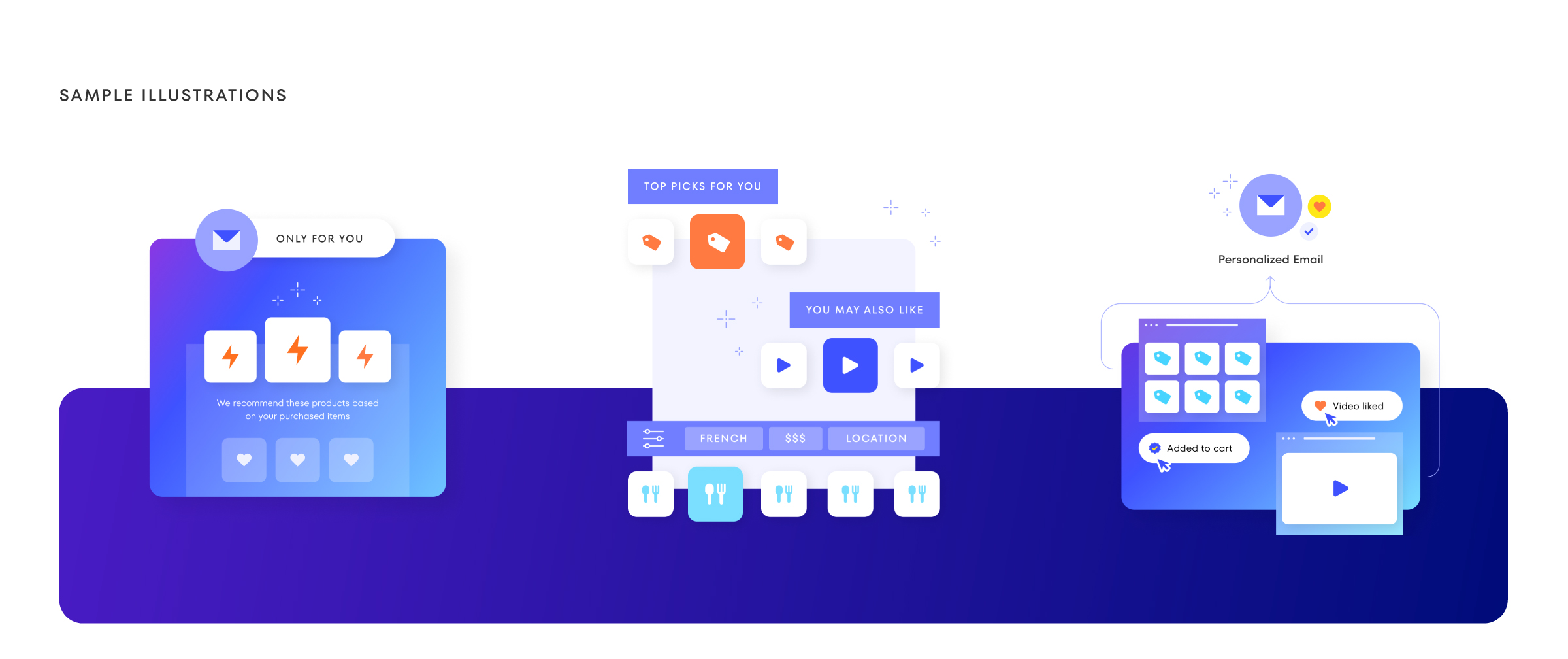
A recommendation engine is hard to brand because nobody can see it. It's math running in the dark. Embeddings, collaborative filtering, semantic graphs. So our illustrator Jess Pales built a custom illustration system that gave all of it a face: how data becomes understanding, and how a good recommendation becomes a small moment of delight for someone shopping at midnight. The illustrations pulled double duty. They explained a complex product, and they made an AI company feel human, which had been the company's argument from the start.


The system had room to grow, too. As the product line expanded, we named new offerings under the parent brand, like Beam and Prism, names that carried the identity's language of light and color into the product itself. We carried the visuals through to a new homepage as well, leaving the team a foundation they could keep building.
The Results
After partnering with Condensed, Crossing minds raised multiple rounds of funding most notably by Shopify, and had raised more than $13.5 million across multiple rounds before their team was finally hired by Open AI in 2025 bringing eight years of work on understanding human intent into one of the defining AI companies of the moment.
They were right early. The rebrand made it visible.
Not many agency relationships will take the time to truly understand & respond to what's happening under the surface. Condensed always went one level deeper than simply executing on deliverables; they took the time to solve problems and strategize based on our overarching goals. This is tough to find in an agency relationship and something we've appreciated enormously.
Isaac Fast – Head of Marketing crossingminds.com
01
Project Services
02
Project Team
Condensed Leads
Brent Lagerman, Teresa Lagerman, Sam Zhao, Jesse Pales
Crossing Minds Leads
Alexandre Robicquet, Emile Contal, Yoshimitsu "Funa" Funabashi

