The Brief
When nüm nüm came to us, the company was called Jellyous Jellies and they were having a hard time getting stores and customers to understand their product which was new to the US market. It’s an Asian-inspired nutritious vegan snack with a texture similar to pudding.
Our challenge with nüm nüm was that most people in the western world have never tried an Asian pudding, and that's the market they were going after. It’s not creamy like the pudding we were used to and it’s not as jiggly as jello, so it's existing name was actually misleading. It’s a super healthy food that is great for breakfast or for a quick snack.
The Solution
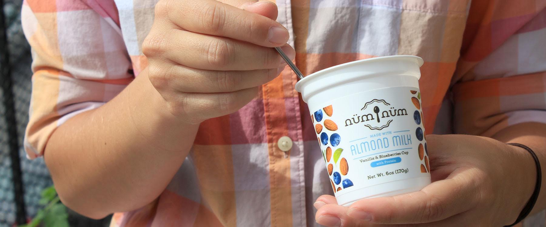
The product is a sharp contrast to all the noise and added sugars in the dairy isle. We wanted that to be clear in the visual branding, with simplicity and wholesomeness as the key points.
The understated packaging speaks about the simple, healthy ingredients in a nüm nüm cup, while the minimal black & white look helps it stand out on the crowded shelves.
Sales have increased greatly because of the new packaging—achieving the goal of getting consumers to pick up the product without in-store demos. Product launch in one store was so successful that product sold out in one week without demos.


The Results
“Hugely successful. I've only received amazing feedback regarding the new name and packaging—it's catchy, memorable, and suits the image.”
–Jingli Wang (founder Nüm Nüm)