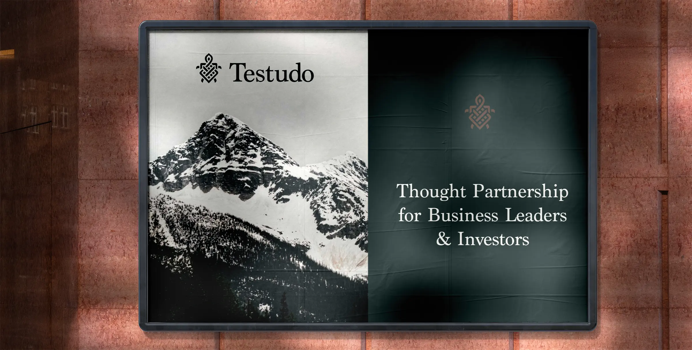
Testudo Advisory is a coaching firm for executives and investors, part business coach and part therapist, helping leaders build thriving companies without burning out. When they came to Condensed, we built their brand identity by starting where the most durable identities start: the meaning hidden inside the name itself. This is how we turned the word "Testudo" into a logo mark, a typography system, and a color palette, and what that process can teach any founder naming and branding a company.
What does the name Testudo mean?
"Testudo" is Latin for "tortoise," or more precisely "tortoise shell." It also names a Roman military formation in which soldiers overlapped their shields above their heads to form a protective shell. Both meanings point at the same idea: steady, deliberate protection that wins over the long run. For a firm that coaches leaders to play the long game, the name was already doing strategic work before we drew a single line. That is the lesson worth pulling out of this project: a strong name gives you a built-in visual brief, and the best branding listens to it rather than inventing something unrelated.
Where the logo concept came from
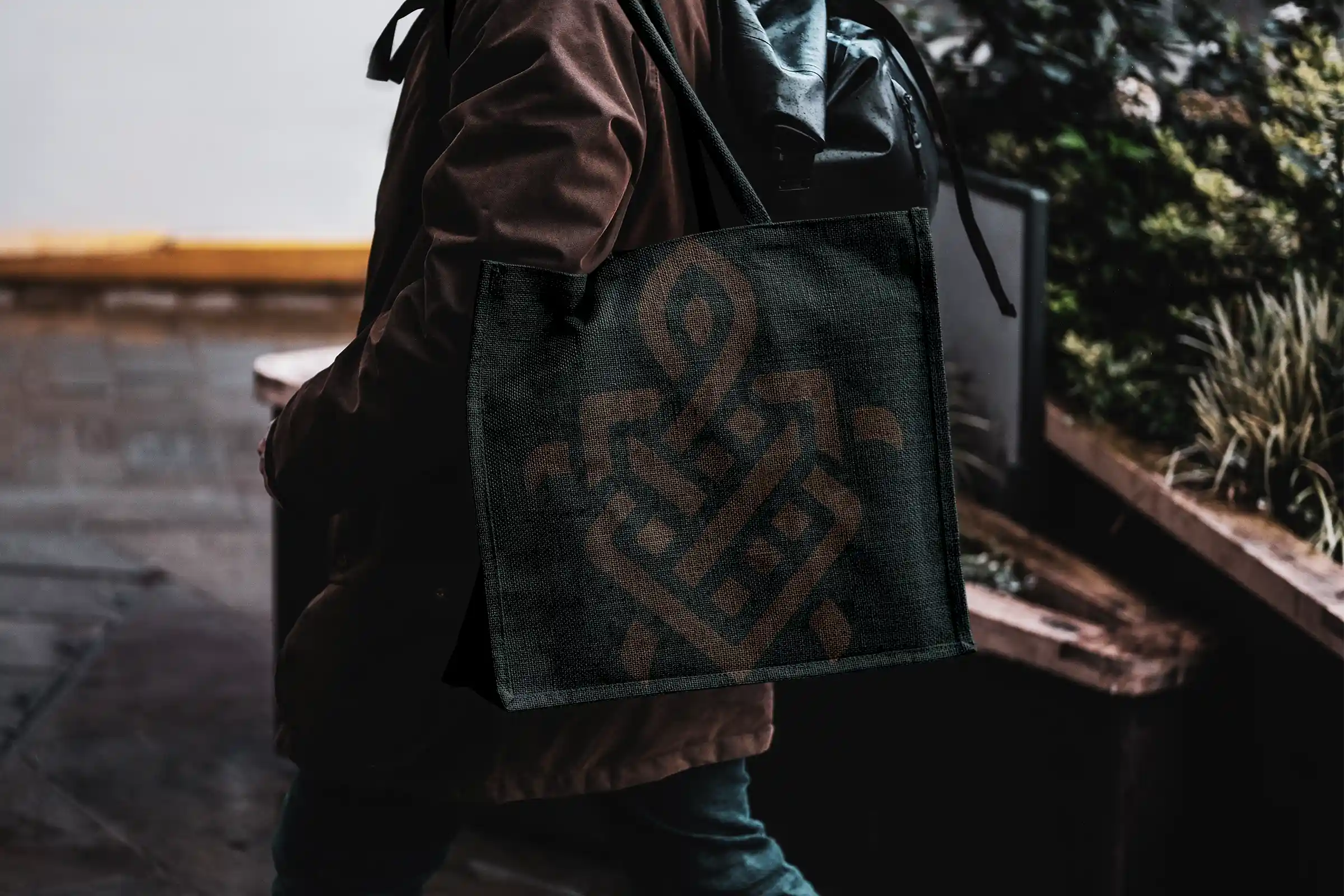
The founder gave us two starting points. The first was the Celtic knot, those endless woven loops with no clear beginning or end, which carry associations of a spiritual journey and of everything being interconnected. The second was the literal meaning of the name, the tortoise and its shell. We sketched toward a mark that fuses the two, a form that reads as both a turtle shell and an unbroken knot, so the symbol holds the brand's "long game" philosophy and the name's origin in a single shape:
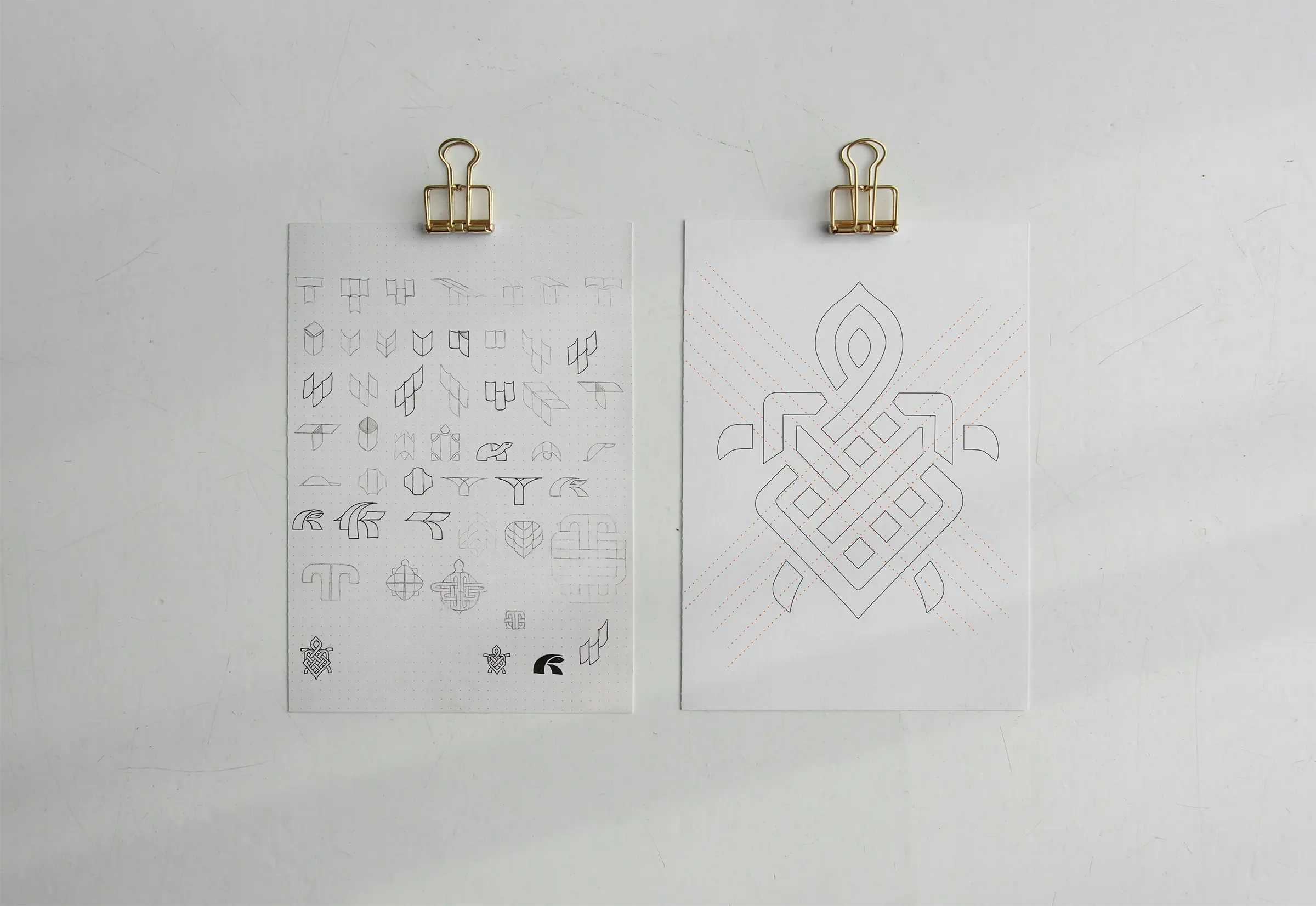
The chosen logo mark was then refined and gridded (right).
Typography: why we chose Marion
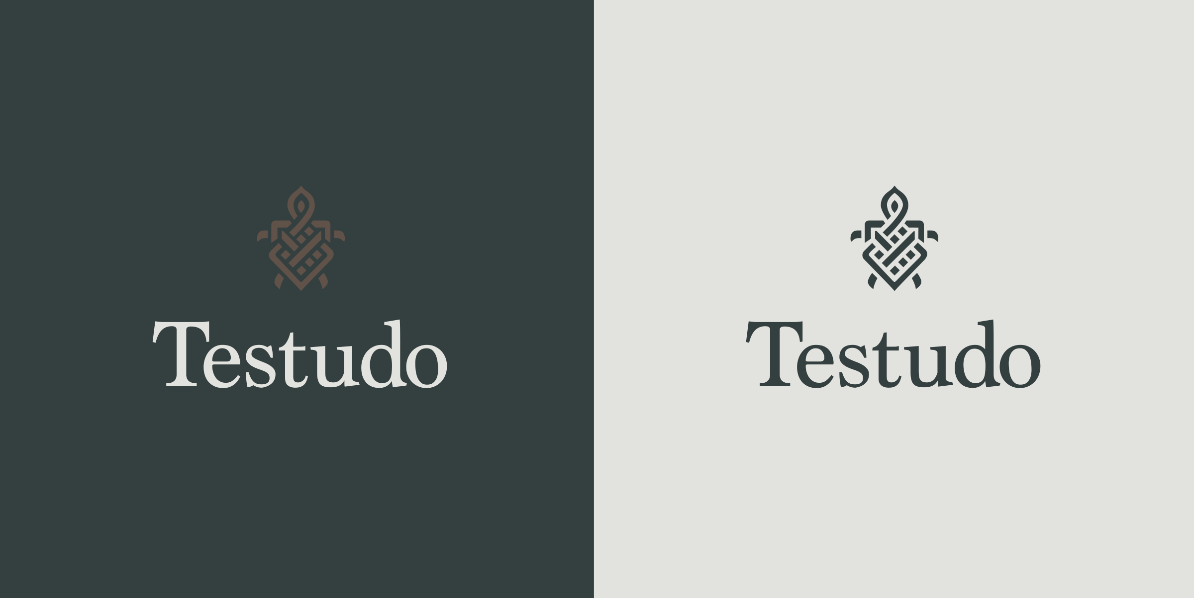
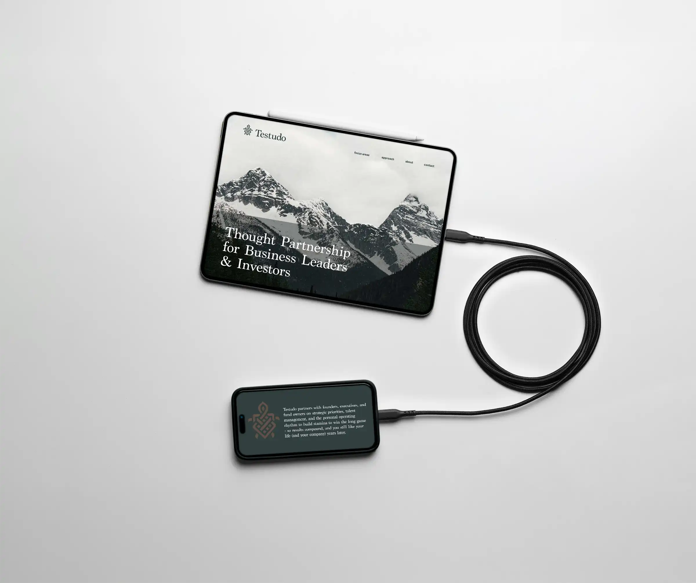
For the logotype we chose Marion, a typeface drawn by Canadian designer Ray Larabie and released by Typodermic in 2006. Marion has neoclassical roots reaching back to the early Bookman cuts of the 18th and 19th centuries, with a hint of Baskerville's elegance and readability, plus character details like its hammer-claw serifs and blunt curls. It feels classic enough to sit beside a Celtic mountain motif and modern enough to keep the brand from reading as dated. The takeaway for founders: pick a typeface whose history reinforces your story rather than fighting it.
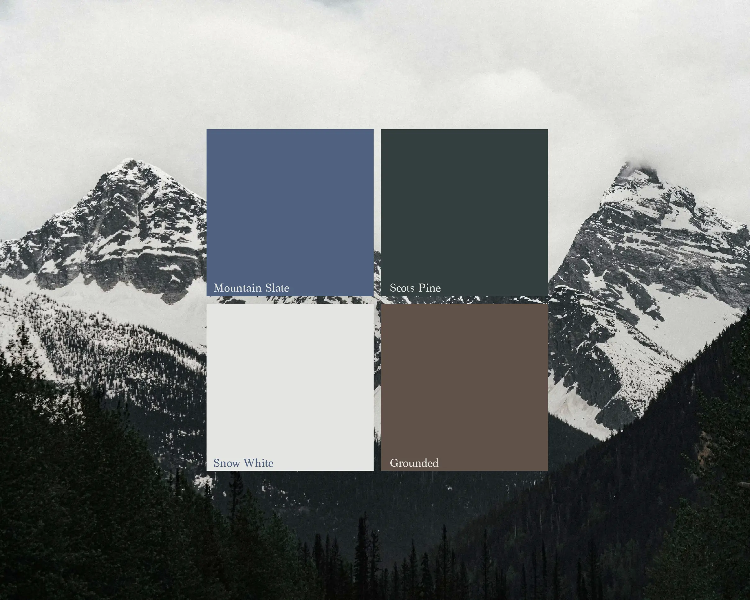
The color palette
The Testudo palette takes its cues from mountain landscapes. It pairs snowy whites, a pine-inspired green, a cold slate blue, and an earthy brown that grounds and warms the whole system. We named the green after the Scots Pine, the only pine native to Ireland, known as "Gius" in Gaelic. It was one of the first trees to recolonize Ireland after the last Ice Age, roughly 12,000 years ago, which fits a brand about endurance and patience.
A small coincidence we like: we built this palette in September 2025, and our "snow white" landed eerily close to the 2026 Pantone Color of the Year, Cloud Dancer, announced shortly afterward.
The Results
Condensed stayed steady and constructive the whole way. The end product is genuinely beautiful and exactly the level of “polished” I was hoping for. If you want someone who can deliver a great-looking brand and keep you grounded through the messy, iterative process of figuring out your message and vibe, I recommend Condensed!
- Kyle Davis - Founder Testudo Advisory
How to design a logo from a brand name's meaning
The Testudo process is repeatable. If you want a mark rooted in your name rather than a trend, work in this order:
- Find the literal and historical meanings of the name, including other languages and origins.
- List the associations and values those meanings carry, and check which ones match your positioning.
- Gather any visual references the founder already connects with the brand.
- Look for a single form that can hold two ideas at once, the way the Testudo mark reads as both shell and knot.
- Choose typography and color whose own history reinforces the same story.
Ready to build a brand rooted in your story?
At Condensed we turn the meaning behind your name, your mission, and your market into an identity that lasts. From naming to full visual identity systems, we build brands that connect, convert, and scale.


