The Brief
Healthcare in America is broken in a familiar way: opaque pricing, surprise bills, and a system that works better for insurers than patients. Sesame was founded to to make quality care genuinely accessible to the millions of Americans who are uninsured, underinsured, or simply need to see a doctor without the runaround. Their vision was clear and innovative, but their brand was far from innovative.
The Problem
When Sesame came to us, they were operating under the name EasyCare. It was the kind of name that made sense on paper, it summed up what they do in the most straight forward way, but it didn't tell their story, it didn't make you feel anything, and it was frankly very boring. We knew the name needed to do more than describe a service. It needed to open a door.
The Solution
Sesame was inspired by "Open Sesame", a phrase that conjures immediacy, access, and a kind of magic simplicity. It captures exactly what the platform delivers: you say the word, the door opens, and you're in. No barriers, no confusion, just care.
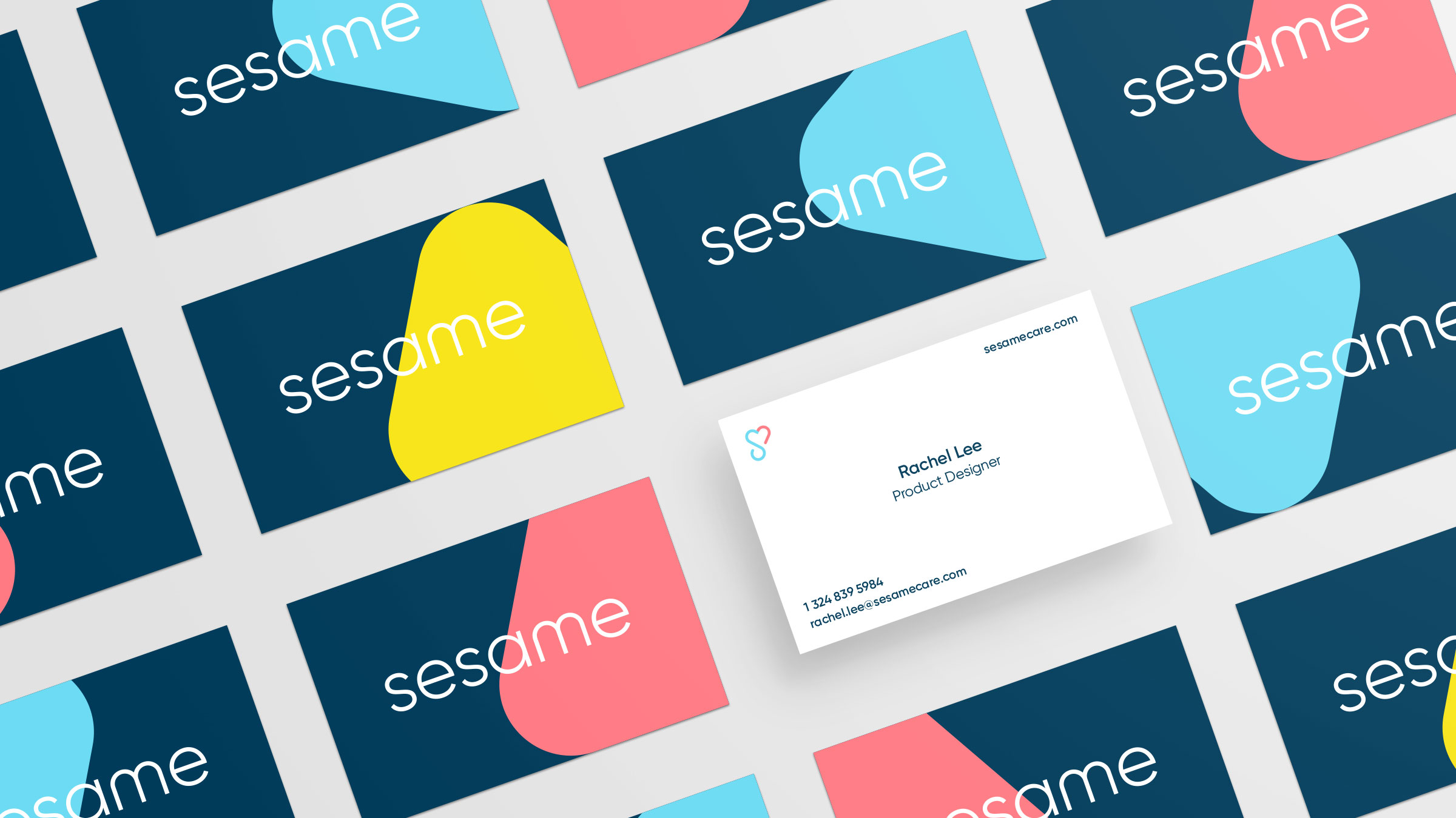

From the name outward, we built a brand identity that is warm, direct, and approachable, a deliberate contrast to the cold, institutional feeling that defines most of healthcare. The personality the Sesame team had always envisioned finally had a visual and verbal language to match.
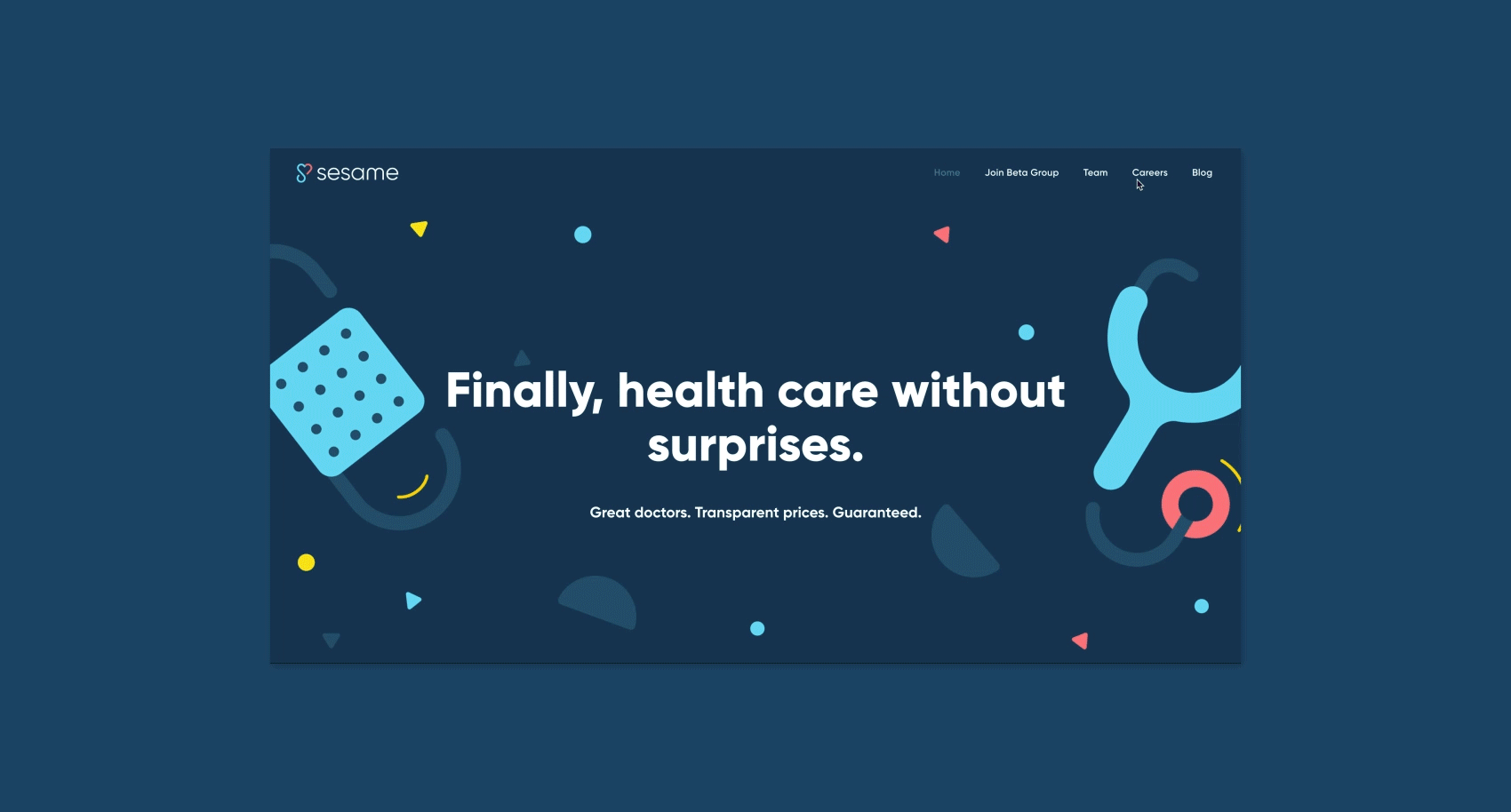
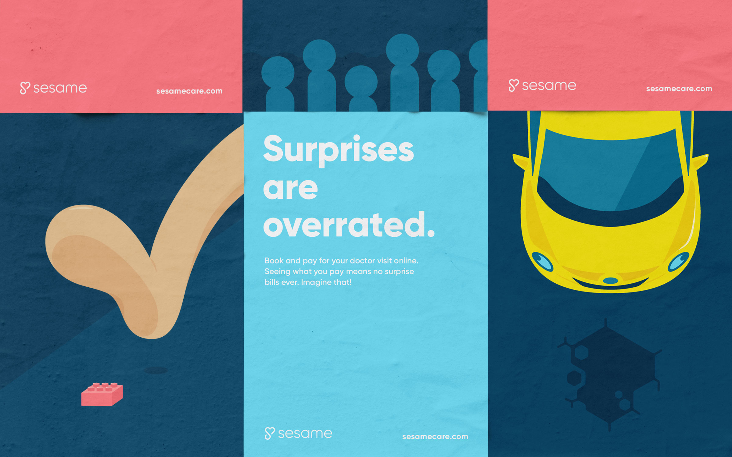
We also partnered with Sesame to develop an initial website to build awareness ahead of their official launch, a foundation designed to grow with them as they continue shaking up the industry.