
The Window
The U.S. Department of Transportation recently proposed a new rule with the unglamorous title "Normalizing Unmanned Aircraft Systems Beyond Visual Line of Sight Operations." The proposal signals a major shift for the drone industry: a future where aircraft can operate beyond their pilot's line of sight, over populated areas, without someone standing in a field monitoring every flight.
DroneForce founder Will Lovis had been waiting for this moment, he's a former Lockheed Martin drone engineer with degrees in aerospace engineering, industrial engineering, and business. Will came to us with a name, a clear technical vision, and a regulatory clock already running.
The Condensed Brand Idea
As part of our brand strategy process, we distill the brand into it's most simple and memorable idea, one that can guide the brand across everything it does. We call this the Condensed Brand Idea. For DroneForce, that idea was Fly Further.
On one level, it's a literal description of the technology. DroneForce's fixed-wing aircraft can operate far beyond the range of conventional short-range drones. On another, it's about what that capability gives customers: more range, more possibilities, and new ways to grow their businesses.
This idea connects the product to the opportunity: the aircraft can go further, and so can the people using it.
Mapping the Landscape
The drone category tends to split between two extremes. Consumer brands lean playful and approachable, while defense and industrial brands often go darker and more aggressive. Much of the rest blends into the familiar B2B tech look: clean, competent, and easy to overlook.
We wanted DroneForce to sit somewhere different. Approachable enough for a farming cooperative, but credible enough for a defense contractor.
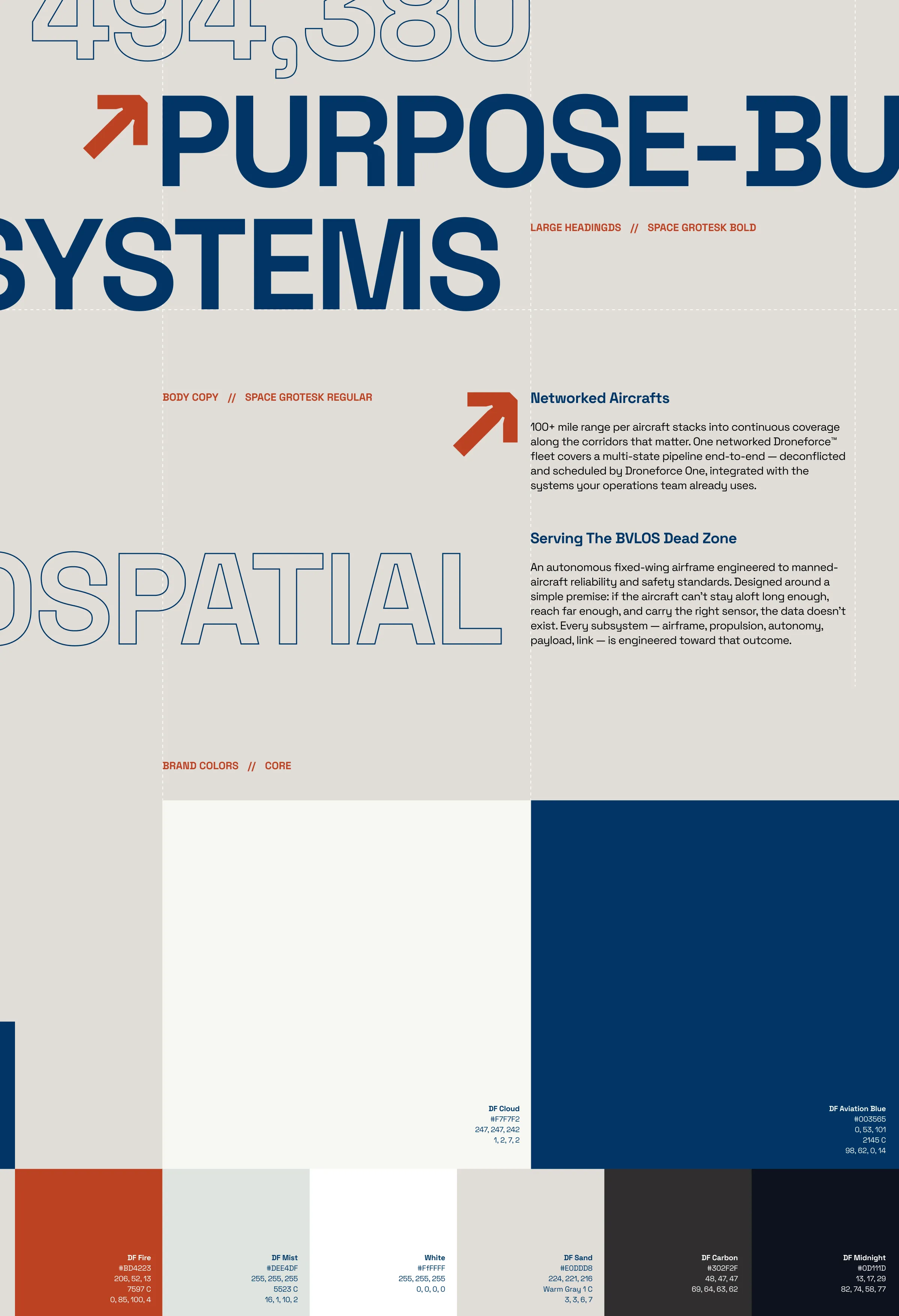
For the visual language, we looked back to the optimism of American aerospace and industrial design rather than today's technology brands. NASA, Atari, Herman Miller technical drawings, and the confident graphics of an era when engineering represented progress all became reference points for the identity.
That led to bold typography, precise geometry, structured layouts, and a restrained palette of light neutrals, deep navy, and a single accent colour.
The DragonFly
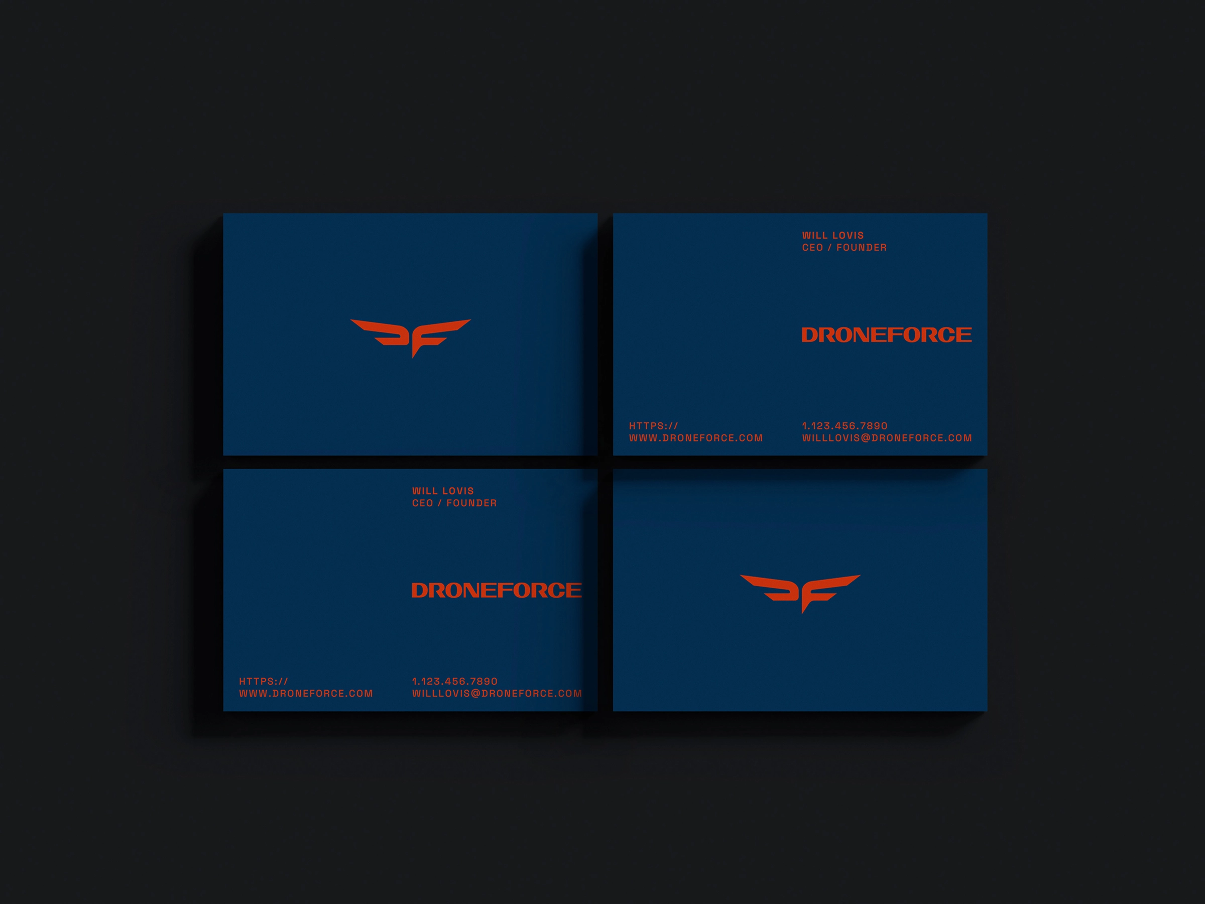
The mark, nicknamed the DragonFly, combines the D and F of DroneForce into a single form. Depending on how you look at it, it's a monogram, a pair of swept wings, or the silhouette of a fixed-wing aircraft seen from above.
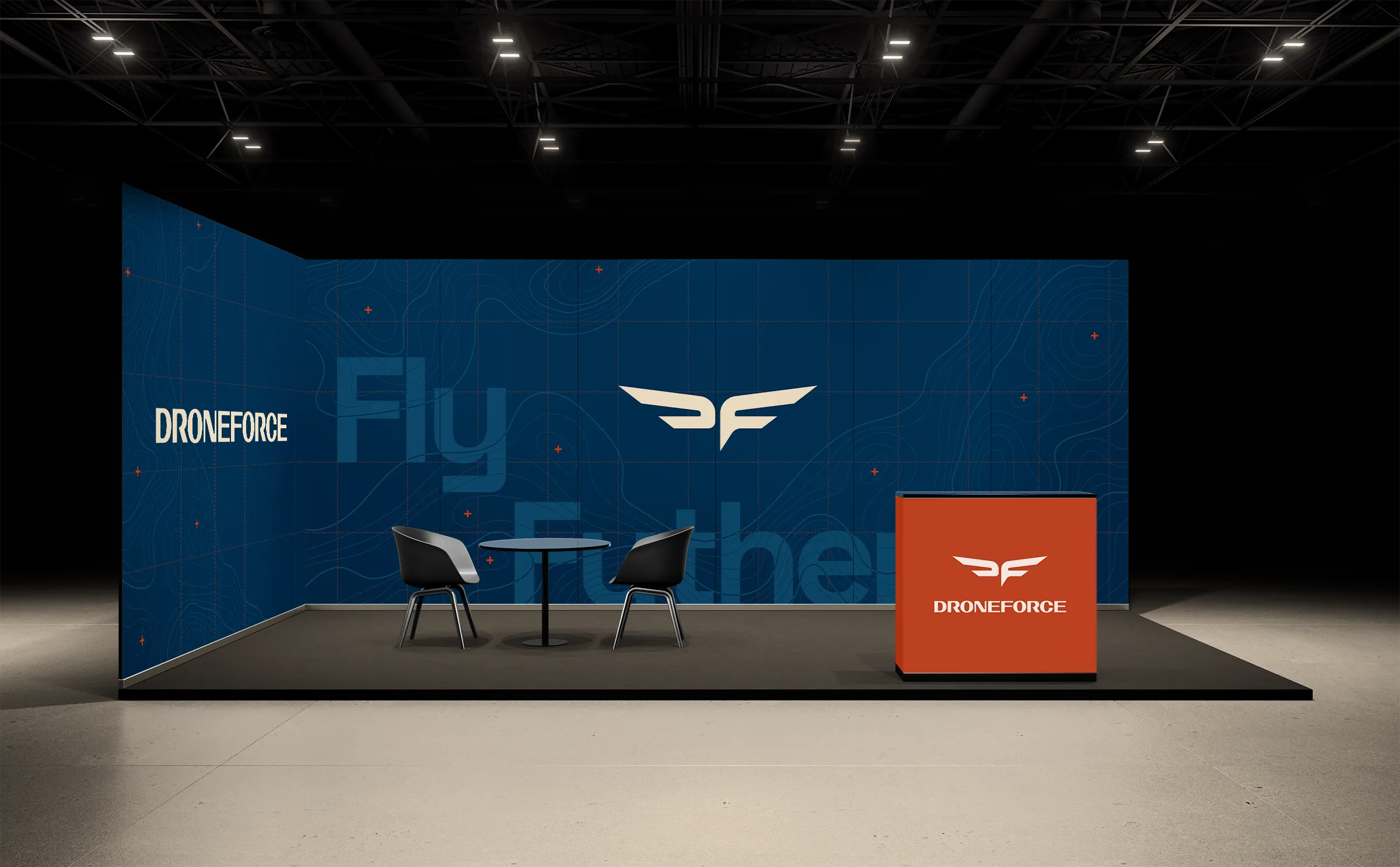
We paired the symbol with a custom wordmark and built a flexible identity system that could scale across everything from aircraft liveries to investor decks and trade show environments.
From Screen to Sky
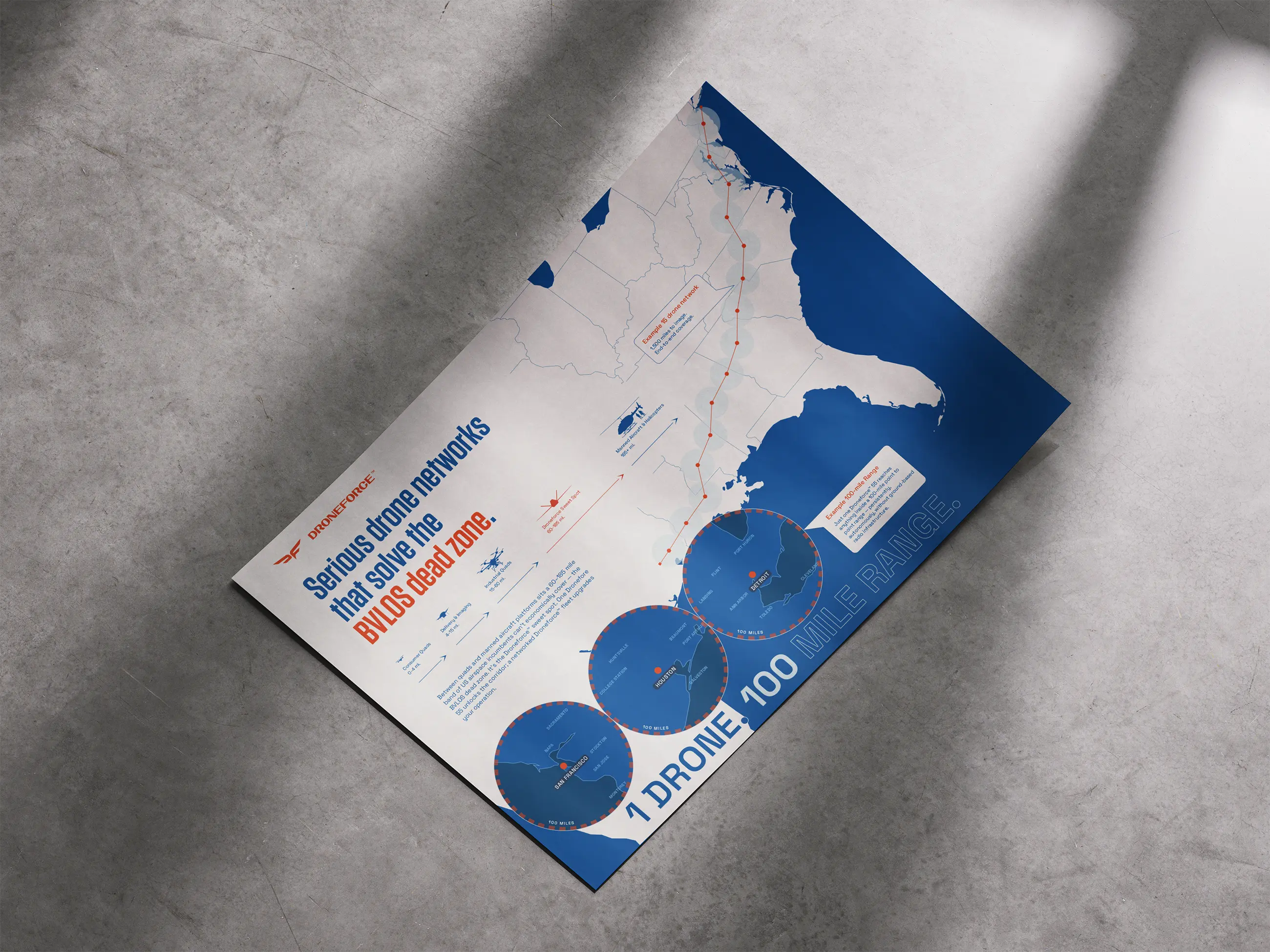
The system was designed to work across the moments that matter most for an aerospace company: customer meetings, investor conversations, trade shows, and the aircraft itself.
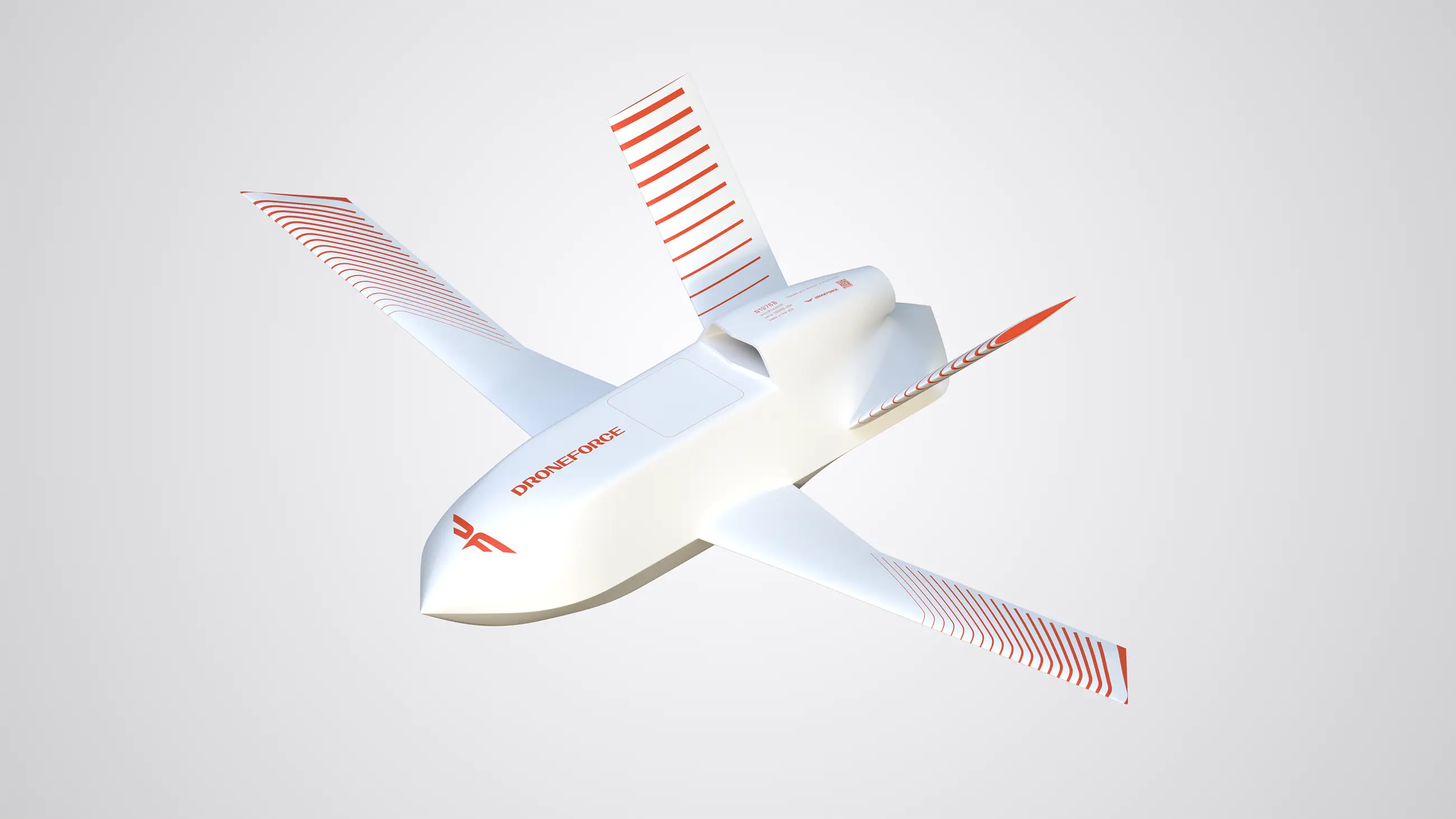
We developed two versions of the aircraft livery. One carries the DroneForce identity directly onto the aircraft. The other uses a custom camouflage pattern designed for operators who need the aircraft to be less visible.
We extended the system across trade show materials, merchandise, and booth graphics, and worked with Terrance Luckett of RC CAD to produce scale models of the aircraft wearing our new liveries.
The brand is now live at droneforce.io. We did not make the website but our DragonFly is perched at the top of the page, presenting the company as the credible operator in a newly opened airspace. Serious enough for a procurement officer. Welcome over your backyard.

